
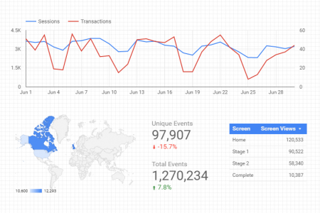
Interactive Dashboards with Data Studio & Bigquery
The US Federal Elections Commission (FEC) has been publishing Political Campaign Finance data for years, but they haven’t made it …
Interactive Dashboards with Data Studio & Bigquery Read More »
Data Visualization is the cherry on top of the data world, it makes information useful and meaningful. By using best practices when creating bars, lines and pies, you will be able to enlighten people not only in your workplace, but also through external analysis of publicly available datasets.
The US Federal Elections Commission (FEC) has been publishing Political Campaign Finance data for years, but they haven’t made it …
Interactive Dashboards with Data Studio & Bigquery Read More »
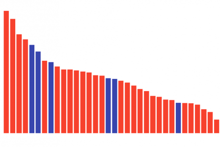
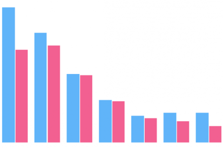
Everyone likes a good movie. And while not everyone is into superheroes, there has been a big wave of great …
Visualizing Marvel & DC Cinematic Universes – POW! Read More »
Over the last few months I have been working more and more with Google Data Studio, a tool provided by …
You might have heard a few weeks ago that the Google Analytics team launched Data Studio (DS), a robust platform …
Empowering Google Analytics with Google Data Studio Read More »
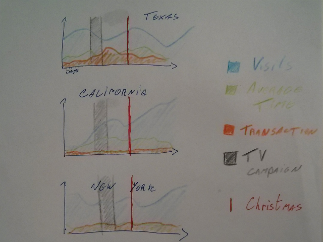
Progressive tracking mechanisms allow you to track virtually anything on your website. Obviously, sending all the clicks and events into …
[March 2017 update: Google Data Studio is now free for everyone globally, all features included.] This week the Google Analytics …

As many of you, I use Google Analytics quite a lot, and I love the visualizations and the interface in …

Recently I published two articles at Think with Google discussing the importance of crafting stories when it comes to data …
In the last few weeks I have been quite immersed in data visualization, trying to understand how it can be …
Visualizing Google Analytics Data With R [Tutorial] Read More »
Have you ever secretly wished to do crazy visualizations with your Google Analytics data? I am sure you have! Well, …
Visualizing Google Analytics Data With Fusion Tables Read More »