In the last few weeks I have been quite immersed in data visualization, trying to understand how it can be used to turn data into insights. As part of my immersion, I have played with Fusion Tables and Google Analytics, and also other ideas that will come to light in the future… As I wrote in the Fusion Tables article, I think everyone secretly wishes to do crazy visualizations with Google Analytics data sometimes, both because it can very insightful or just incredibly fun 🙂
And here I am again, with another custom visualization! But this time I decided to use the R programming language, which is considered to be one of the best options when it comes to statistical data visualization.
As I looked deeper into R, I tried to understand what kind of visualizations would complement Google Analytics (GA), i.e. what can we get out of R that we can’t currently get out of GA. My first idea was to try and create a visualization that would allow me to look at my top 5 US states by number of visits (or countries if you wish) and see how they are performing side by side. In addition, I wanted to see how Christmas and a TV campaign affected the behavior across US States. While this is possible to understand using Google Analytics, I believe it would not be possible to visualize it in such a way.
Once I found this interesting use case, I decided to take my artistic capabilities out of the rusty box and sketch the output I was looking for… and here is what I got.

With this objective in mind, I rolled up my sleeves and started working… Below is a step-by-step guide on how to build a very similar visualization using your own Google Analytics data. If you know your way through R, you can simply download this commented txt file.
Important: please note that while I try to describe the process as detailedly as possible, an introduction to R would be very recommended. If you have some time to invest try the Computing for Data Analysis Coursera course, or just watch the YouTube playlist Intro to R. I am also providing a list of helpful books in the end of the article.
Installing R, the Google Analytics package and others
If you are completely new to R, you will first need to download R and follow the instructions to install it. After you do that, I recommend you also install R Studio, a great tool for you to write and visualize R code.
Now download the Google Analytics package into your R workspace (below I am using version 1.4). If you don’t know where is your workspace just type the line below into your console.
getwd()
Enter the following lines into R to install and load the respective packages, they are necessary for this visualization.
install.packages(c("RCurl", "rjson", "RGoogleAnalytics", "ggplot2", "plyr", "gridExtra", "reshape"))

require("RCurl")

require("rjson")

require("ggplot2")

require("plyr")

require("gridExtra")

require("reshape")

require("RGoogleAnalytics")
Getting the data and preparing it for visualization
Step 1. Authorize your account and paste the accesstoken – you will be asked to paste it in the console after you run the second line below.
query <- QueryBuilder()
access_token <- query$authorize()
Step 2. Initialize the configuration object - execute one line at a time.
conf <- Configuration()

ga.account <- conf$GetAccounts()
ga.account

// If you have many accounts, you might want to add "ga.account$id[index]" (without the ") inside the ( ) below to list only the web properties inside a specific account.

ga.webProperty <- conf$GetWebProperty(ga.account$id[9])
ga.webProperty
Step 3. Check the ga.account and ga.webProperty lists above and populate the numbers inside [ ] (i.e., substitute 9 and 287) below with the account and profile index you want (the index is the first number in each line of the R console). Then, get the webProfile index from the list below and use it to populate the first line of step 5.
ga.webProfile <- conf$GetWebProfile(ga.account$id[9],ga.webProperty$id[287])
ga.webProfile
Step 4. Create a new Google Analytics API object.
ga <- RGoogleAnalytics()
Step 5. Setting up the input parameters - here you should think deeply about your analysis time range, the dimensions (note that in order to do a line chart for a time series you must add the "ga:date" dimension), metrics, filters, segments, how the data is sorted and the # of results.
profile <- ga.webProfile$id[1]
startdate <- "2013-12-08"
enddate <- "2014-02-15"
dimension <- "ga:date,ga:region"
metric <- "ga:visits, ga:avgTimeOnSite, ga:transactions"
filter <- "ga:country==United States"
sort <- "ga:date"
maxresults <- 10000
Step 6. Build the query string, use the profile by setting its index value.
query$Init(start.date = "2013-12-08",

           end.date = "2014-02-15",

           dimensions = "ga:date, ga:region",

           metrics = "ga:visits, ga:avgTimeOnSite, ga:transactions",

           sort = "ga:date, -ga:visits",

           filters="ga:country==United States",

           max.results = 10000,

           table.id = paste("ga:",ga.webProfile$id[1],sep="",collapse=","),

           access_token=access_token)
Step 7. Make a request to get the data from the API.
ga.data <- ga$GetReportData(query)
Step 8. Check your data - head() will return the first few lines of the table.
head(ga.data)
Step 9. Clean the data - removing all (not set) rows.
ga.clean <- ga.data[!ga.data$region == "(not set)", ]
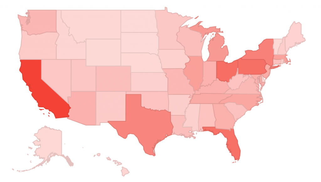
Step 10. Choose your data - get the data for the specific states (or countries) that you want to analyze. Notice that I am using only the Top 5 countries as I think more than that would be a bit too much to visualize, but it is up to you.
sum <- ddply(ga.clean,.(region),summarize,sum=sum(visits))
top5 <- sum[order(sum$sum,decreasing=TRUE),][1:5,]
top5
Step 11. Build the final table containing only the countries you want.
d <- ga.clean[ga.clean$region %in% c("California", "Texas", "New York", "Florida", "Illinois"),]
Building the visualization: legends and line charts
Step 12. Build the special campaign bars and legend (in this case Christmas and Campaign)
g_legend<-function(a.gplot){
  tmp <- ggplot_gtable(ggplot_build(a.gplot))
  leg <- which(sapply(tmp$grobs, function(x) x$name) == "guide-box")
  legend <- tmp$grobs[[leg]]
  return(legend)}

rect_campaign <- data.frame (
  xmin=strptime('2014-01-25',"%Y-%m-%d"),
  xmax=strptime('2014-01-30', "%Y-%m-%d"),
  ymin=-Inf, ymax=Inf)

rect_xmas <- data.frame (
  xmin=strptime('2013-12-25',"%Y-%m-%d"),
  xmax=strptime('2013-12-26', "%Y-%m-%d"),
  ymin=-Inf, ymax=Inf)

fill_cols <- c("Christmas"="red",
               "Campaign"="gray20")

line_cols <- c("avgTimeOnSite" = "#781002",
               "visits" = "#023378",
               "transactions" = "#02780A")
Step 13. Build the chart legend and axis.
get_legend <- function(data) {
  d_m <- melt(data,id=c("region", "date_f"))
  p <- ggplot() +
    geom_smooth(data = d_m, aes(x=date_f, y=value,group=variable,color=variable),se=F) +
    geom_rect(data = rect_campaign,
              aes(xmin=xmin,
                  xmax=xmax,
                  ymin=ymin,
                  ymax=ymax,
                  fill="Campaign"), alpha=0.5) +
    geom_rect(data = rect_xmas,
              aes(xmin=xmin,
                  xmax=xmax,
                  ymin=ymin,
                  ymax=ymax,
                  fill="Christmas"), alpha=0.5) +
    theme_bw() +
    theme(axis.title.y = element_blank(),
          axis.title.x = element_blank(),
          legend.key = element_blank(),
          legend.key.height = unit(1, "lines"),
          legend.key.width = unit(2, "lines"),
          panel.margin = unit(0.5, "lines")) +
    scale_fill_manual(name = "", values=fill_cols)  +
    scale_color_manual(name = "",
                       values=line_cols,
                       labels=c("Number of visits", "Average time on site","Transactions"))
  legend <- g_legend(p)
  return(legend)
}
Step 14. Build the charts!
years <- substr(d$date, 1, 4)
months <- substr(d$date, 5, 6)
days <- substr(d$date, 7, 8)
d$date_f <- strptime(paste(years, months, days, sep="-"), "%Y-%m-%d")
d$date <- NULL
d$X <- NULL

l <- get_legend(d)

p1 <- ggplot(d, aes(x=date_f, y=visits,)) +
  geom_line(colour="#023378") +
  ggtitle("Number of visits") +
  geom_rect(data = rect_campaign,
            aes(xmin=xmin,
                xmax=xmax,
                ymin=ymin,
                ymax=ymax),
            fill="grey20",
            alpha=0.5,
            inherit.aes = FALSE) +
  geom_rect(data = rect_xmas,
            aes(xmin=xmin,
                xmax=xmax,
                ymin=ymin,
                ymax=ymax),
            fill="red",
            alpha=0.5,
            inherit.aes = FALSE) +
  facet_grid (region ~ .) +
  theme_bw() +
  theme(axis.title.y = element_blank(),
        axis.title.x = element_blank(),
        panel.margin = unit(0.5, "lines"))


p2 <- ggplot(d, aes(x=date_f, y=avgTimeOnSite,)) +
  geom_line(colour="#781002") +
  geom_rect(data = rect_campaign,
            aes(xmin=xmin,
                xmax=xmax,
                ymin=ymin,
                ymax=ymax),
            fill="grey20",
            alpha=0.5,
            inherit.aes = FALSE) +
  geom_rect(data = rect_xmas,
            aes(xmin=xmin,
                xmax=xmax,
                ymin=ymin,
                ymax=ymax),
            fill="red",
            alpha=0.5,
            inherit.aes = FALSE) +
  facet_grid (region ~ .) +
  ggtitle("Average time on site") +
  coord_cartesian(ylim = c(0, 250)) +
  theme_bw() +
  theme(axis.title.y = element_blank(),
        axis.title.x = element_blank(),
        panel.margin = unit(0.5, "lines"))

p3 <- ggplot(d, aes(x=date_f, y=transactions,)) +
  geom_line(colour="#02780A") +
  facet_grid (region ~ .) +
  geom_rect(data = rect_campaign,
            aes(xmin=xmin,
                xmax=xmax,
                ymin=ymin,
                ymax=ymax),
            fill="grey20",
            alpha=0.5,
            inherit.aes = FALSE) +
  geom_rect(data = rect_xmas,
            aes(xmin=xmin,
                xmax=xmax,
                ymin=ymin,
                ymax=ymax),
            fill="red",
            alpha=0.5,
            inherit.aes = FALSE) +
  ggtitle("Number of transactions") +
  theme_bw() +
  theme(axis.title.y = element_blank(),
        axis.title.x = element_blank(),
        panel.margin = unit(0.5, "lines"))

grid.arrange(arrangeGrob(p1,p2,p3,ncol=3, main=textGrob("US States: Website Interaction & Commerce", vjust=1.5)),l,
             ncol=2,
             widths=c(9, 2))
Phew! Here is the chart you should get!
The chart is not exactly what I initially thought, but having all metrics in one chart was a bit problematic as the scale was too different and we would barely see the transactions chart. But I like it this way :-)

If you already use R to analyze and visualize Google Analytics data, send us an email, we would love to publish other examples.