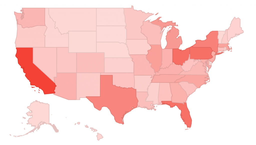
Have you ever secretly wished to do crazy visualizations with your Google Analytics data? I am sure you have! Well, there are several ways to do that, the most powerful being the Google Analytics API in conjunction with powerful visualization tools.
However, sometimes visualization tools may require technical knowledge or are just too expensive. That’s why I thought about using Google Fusion Tables to provide a few complementary visualizations to Google Analytics – it is a great tool, very user friendly, and free.
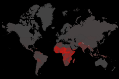
In this article I provide a quick step-by-step guide to use Fusion Tables to visualize Google Analytics data: how to bring the data, prepare it, and visualize it using great charts. By the end of the article you will be able to create a visualization just like the one below, which includes data from Google Analytics and from a public dataset. Click on a dot on the map to see how cool it is! (I included icons to note where data was brought from Google Analytics and where it was brought from Wikipedia)
Bringing Data From Google Analytics To Fusion Tables
Following the publication of this article I was contacted by a colleague at Google that suggested I should use a Google App Script to programmatically export data from Google Analytics into Fusion Tables. Here is the result: Integrating Google Analytics & Fusion Tables [Tutorial].
Below is a quick video tutorial on how to export your Google Analytics data directly into Fusion Tables using Apps Scripts.
If you still prefer going through the manual process it is up to you. If not, you can jump to number two below – Data Manipulation: Creating A Master Google Fusion Table.
1. Data Creation: Exporting Data from Google Analytics to Drive
Keep in mind that as of the writing of this article, you can download data from the Google Analytics report which you are viewing, with the metrics that you are viewing. This means that if you are looking at the GEO Location standard report, you will download the countries along with the standard metrics: Visits, % New Visits, Bounce Rate… If you want, for example, to export E-Commerce data in addition to to the standard metrics, you will need to export two reports and then merge them using Fusion Table. And that’s exactly the example I will use below!
As mentioned, I am going to show how to visualize GEO data; first because I think GEO is cool and I love maps, and second because I believe it is a rich example that showcases interesting parts of the Fusion Table product.
If you would like to follow this tutorial using your own data, start by visiting the GEO Location report (direct link) to download your data to Google Spreadsheets. Here is how to do it:
- Click the drop down on the bottom of your table that says Show rows and choose 500, it should be enough to include all available countries (or states, if you choose to analyze USA States for example).
- Above the map you will find a link that says Export, click on it and choose Google Spreadsheets.
- This will export the standard metrics. If you want to export Goal metrics, Ecommerce or AdSense metrics, click on the link just above the map and repeat 1 and 2 above.
Below are pointers to steps 2 and 3 from the list above.

2. Data Manipulation: Creating A Master Google Fusion Table
[If you are using the programatic approach, you can jump to the section below: “You have a table!”]
Now we have two Google Spreadsheets and we want to merge them into one Fusion Table. However, as far as I could understand you can’t just upload two Spreadsheets into one Fusion Table, you have to create two Fusion Tables and then merge them. So that’s what we are going to do now.
First, open your Spreadsheets and delete the first few rows, the ones that contain the summary of the data and some empty rows. This will save time and keep the data organized.
In addition, delete the last column of the Spreadsheet, it is a summary of all data and can cause some confusion when merging the Spreadsheets.
Last, create a Fusion Table (direct link) and choose your Spreadsheet as the source. Click Next. You will see the first few rows of your data, make sure they look fine. Click Next. You will be requested to give your table a name and other technicalities. Click Finish.
You have a table!
Click on the Map of Country tab above the table. You should see a popup letting you know that the Google Maps Geocoding service is placing addresses on the map.

Now repeat the process above with your second Spreadsheet (if you have one).
Only then you should merge both tables by clicking on File > Merge in any of them. You will be prompted with a popup to choose the second table you want to merge (which should be in your Drive account as you created the table in there). Once you choose the table, you will be asked to Confirm the source of match which, in our case, will be Country / Territory.

Choose the metrics that you would like to merge and you are done!
3. Data Enhancement: Merging Publicly Available Data to Google Analytics
Now that you have your Google Analytics data ready, you should consider merging it with public datasets offered through Fusion Tables; if you are using Country data tables you will find a few. To do so, click on File > Find a table to merge with… and you will see the following:

Note that just below the dataset name you will see a note: 98% of rows have a match – this will tell you if the dataset matches your data or not. It is up to you to decide which percentage is good enough.
Building Interactive Maps with Google Analytics
Now the fun begins! Here is a dataset I created using the data described above. I integrated some Google Analytics data with a dataset called World Data – Internet Users per Country, where I got country data for the number of Internet users, percent of population with access to Internet, the country flag and a few more columns.
The first visualization I decided to create is a map.
There are numerous ways to customize the map, starting from choosing between a Feature Map and a Heatmap. I chose a Feature Map as it enables us to add interesting information into the map; I believe the Heatmap feature is less valuable than what Google Analytics offers through through its interface, but I won’t go into explanations…
Here are a few of my decisions when creating the visualization above, separated by the two main formatting categories: feature styles and info window.

1. Feature Map Styles
In these options (labeled 1 at the screenshot above), you will be able to design the marker icon, colors, lines and legend. I believe the most interesting setting in this session is the marker icon. As you probably saw in the map legend, I used the color of the marker icon to indicate a country’s traffic quality using Bounce Rates as a proxy. If the marker is red, bounce rate is above 66%, yellow is between 33 and 66% and green is below 33%. Below is a screenshot showing how to do it:
- Choose “Change feature styles…” just besides the map (#1 on screenshot above).
- Choose “Marker icon” on the left sidebar (#2 on screenshot below)
- Choose the tab called “Buckets”
- Choose the number of buckets you want to divide your data into (notice that the more buckets you use the harder it will be to differentiate between them in the map.)
- Choose the metric you want to use to differentiate the markers, e.g. visits, bounce rate, revenue… Also note that just below the drop down you are asked which range should be used; if it is a “rate” you should use “0 – 1”.
- Choose the colors of your buckets and how they should be divided (if you want to separate them unequally.)
- Click Save
![]()
2. Feature Map Info Window
The info windows are the windows that appear when you click one of the markers, and you can customize them in almost any way you want, anything that can be done via HTML (no JavaScript though). When you click on the Change info window… option (two screenshots above), you are given two options: Automatic or Custom. I personally think that you can do better with Custom windows. Here are some of the things you can do (this is my custom code):
{Country / Territory}
![]() Last quarter, we had a total of {Visits} Visits from {Country / Territory}, of which {% New Visits} were first time visits. The percentage of visitors that made at least one purchase was {Newsletter Signup (Goal 2 Conversion Rate)}. Visitors coming from {Country / Territory} stayed an average of {Avg. Visit Duration} on the website and {Bounce Rate} of them left the website without interacting with it (Bounce Rate).
Last quarter, we had a total of {Visits} Visits from {Country / Territory}, of which {% New Visits} were first time visits. The percentage of visitors that made at least one purchase was {Newsletter Signup (Goal 2 Conversion Rate)}. Visitors coming from {Country / Territory} stayed an average of {Avg. Visit Duration} on the website and {Bounce Rate} of them left the website without interacting with it (Bounce Rate).
![]() As a side note, {Country / Territory} has {Internet users} Internet Users and {percent of population} of the population has access to the Internet.
As a side note, {Country / Territory} has {Internet users} Internet Users and {percent of population} of the population has access to the Internet.
As you will see, I am doing a series of customizations: adding images (both from the table using {placeholders} and from external sources), height, width, style and others. Again, the custom windows will accept anything that can be written using HTML.
Visualizing Data Using Custom Cards
Another interesting visualization feature on Fusion Tables are Custom Cards. They are less visually appealing, but they might be interesting in that they allow filtering and they show all the data open before you. It may be a better way to visualize more information for deeper analysis. Here they are:
The customization is very similar to the map info window described above, it will accept anything that HTML can do. Here is my example code if you would like a starting point.
{Country / Territory}
Visits: {Visits}
Conversion Rate: {Newsletter Signup (Goal 2 Conversion Rate)}
% New Visits: {% New Visits}
Bounce Rate: {Bounce Rate}
Pages / Visit: {Pages / Visit}
Internet Users: {Internet users}
Publishing Your Visualizations Online
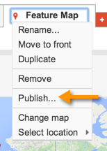 Publishing your data will be as strait-forward as doing the manipulations above, two clicks and BAM! However, if you want your visualization to be limited only to one website (e.g. your Intranet) you will need a
Google Maps API for Business Client ID (and here are the details if you have one). But if you just want to showcase your visualization for everyone to see, here is how you do it.
First of all, your data sharing settings must be either Anyone with the link or Public on the web, otherwise when the map is embedded it will return an error. To change your sharing settings, click on Share on the top-right bottom of your table and change the Who has access part of it to one of the settings above. Then click on the arrow shown on the screenshot to the left and choose between sending a link or embedding it in a website.
You are done!
Closing Thoughts
In this article I showed how to export Google Analytics data to Google Fusion Table, merge it with other datasets and then visualize it. I provided a common example where a map would be a great solution, but there are many other examples out there… If you think this is a valuable tool and would like to contribute an example to Online Behavior, let us know!

