Over the last few months I have been working more and more with Google Data Studio, a tool provided by Google to explore and visualize data. During this period I have created best practices for Ecommerce reports and Publisher reports to share with Google Analytics users. I believe that Data Studio is a great solution for businesses and I will keep working on best practices and sample reports for marketers, advertisers, publishers, etc.
However, Data Studio can (and should!) be used to visualize the world around us too, helping us answer questions such as: How are we affecting our planet? How is society evolving? How people behave across different countries and cultures? Those questions (and many others) are not easy to answer, but data visualization is the best way to understand the world around us. Thankfully, many governments and global organizations are releasing their data publicly, which means we can create stories out of those datasets to start answering the questions above.
In this article I will present a visualization using data from the US Bureau of Labor Statistics to show trends in US Unemployment Rates segmented by Age, Gender and Race / Ethnicity. This data is important in that it provides us with insights on how we are doing as a society to provide equal opportunities to everyone. Needless to say, we have a long way to go!
US Unemployment Rates by Age, Gender and Race / Ethnicity
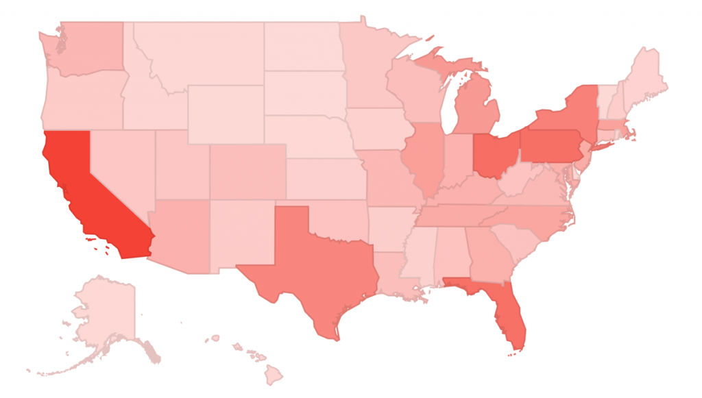
Below is a screenshot of the visualization, you can access the interactive version on Data Studio. If you are interested on some thoughts from the creation process, keep on reading!

The Data
The data was pulled from the US Bureau of Labor Statistics and it contains data for 2014 and 2015, drilling down into Race / Ethnicity, Age and Gender. Note that the page linked updates with new data every now and then, so what you see there is not necessarily what was used in the visualization. The data was copied into this Google Sheet, and than reformatted into a flat table (see additional tab in the same spreadsheet). The reason for the reformatting is that the Data Studio connector with Google Sheets will work only with flat tables. That’s it for data manipulation, not a big deal in this case, although sometimes it can be quite a hassle to get data into the right format for visualization. Below is a screenshot of the final Data Source on Data Studio.

The Visualizations
Since this is a publicly available report, and I wanted it to be a standalone visualization, I added my thoughts side-by-side with the visualizations, this helps viewers to understand the data. Here are the points highlighted throughout the report:
- Unemployment rates are significantly higher for younger (males) and for the Black / African American populations.
- Among the top 5 groups with the most significant drop in unemployment rate three are Asian, and the top 3 groups that got the most significant unemployment rate increase between 2014-15 are Hispanic / Latino.
- Black/African American has the highest unemployment rate, but it is improving significant faster than Hispanic/Latino and White. Asian has the best rates and it is improvement relatively fast.
One note regarding the insights: you should aim to have between 3 and 5 main insights per page on your Data Studio reports, this will help your viewers focus their attention.
Sharing is Caring
Sharing is very simple. Once you finish the analysis, you only have to click on share (top-right) and choose “Anyone with the link can view” (learn how). But make sure you check the data source usage guidelines to confirm that their data can be shared, this is extremely important!
Hopefully this visualization will bring some light into how we are developing as a society. But I am even more hopeful that it will inspire other people to use their data skills to start visualizing datasets that can help us create a better world.