[March 2017 update: Google Data Studio is now free for everyone globally, all features included.] This week the Google Analytics team released some very exciting news: Google Data Studio will be available to everyone! There will still be the robust Data Studio 360 for enterprises, but a standard version will be available to everyone to create beautiful and insightful visualizations. This is great news to all data professionals and enthusiasts, as there aren’t any first class data platforms that can be used to access, transform, visualize, collaborate and share data at scale and for free!
In this article I will discuss how Data Studio relates to other Google Analytics products (specifically the Google Analytics 360 Suite) and then I will go on to show how to use Data Studio (DS). There are a few areas I will focus on: how to access / transform / manage your data and how to visualize / collaborate / share it. (I know, it’s a lot to focus on, but stay with me!)
Data Studio and the Google Analytics platform
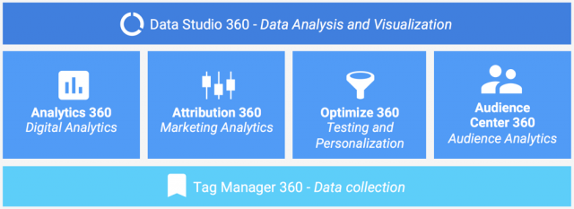
You probably heard about the Google Analytics 360 Suite, a platform that will help you evaluate the full customer journey and drive results. The Suite is comprised of 6 products, as schematized below.
Here is the mission of each of the Suite products:
- Tag Manager 360 – Data Collection: Get more data and less hassle with powerful APIs and partnerships.
- Analytics 360 – Digital Analytics: Gain new insight with a total view of the customer experience.
- Attribution 360 – Marketing Analytics: Discover the true value of all your marketing channels.
- Optimize 360 – Testing and Personalization: Test and deliver more personal experiences on your site.
- Audience Center 360 – Audience Analytics: Match the right people with the right message.
- Data Studio 360 – Data Analysis and Visualization (cherry on top!): Build beautiful and shareable reports, with all your data in one place.
If you are using the free products, you will have access to the current versions of Google Analytics, Tag Manager, and the new Data Studio!
While the first 5 products are about collecting, analyzing and acting on the data, DS is about letting the data speak, uncovering insights through visual exploration. It is a great tool to craft a data story that can resonate with all its consumers.
Google Data Studio Overview
Let’s start with what you can do on Data Studio. I like the diagram below, from my colleague Nick Mihailovski, Lead Product Manager for Data Studio. I think it summarizes well a common analysis workflow and the tool capabilities. 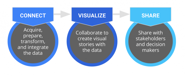
Connect – The first thing you have to do when working with data is making sure you have it! Once you do, check whether any preparation is required (e.g. calculated fields, different formatting, cleaning up) in order to make the data useful.
Visualize – Once the data is ready to go, you will open your canvas and start connecting the dots, beautifying the charts and making sure they tell an insightful story. The cool thing is that now you can collaborate and work across cities or continents in the same way that you already do with Google Docs, Sheets and Slides. Analysts of the world, unite!
Share – And since you are having so much fun and finding so many insights, why not share it with your colleagues? I am sure they will appreciate! Even though we are making sharing simpler, a click of a button, remember that data is a serious business, make sure you think through before you share. Now that you know what you can do with Data Studio, let’s do it, login at https://datastudio.google.com. You will see something similar to the following page.

The interface is pretty straightforward. You can choose an account (if you have multiple) in the top right corner; and you can see all, shared, or trashed reports (default page) and Data Sources. Easy peazy.
Let’s dive in and look at some cool stuff available through DS. I will start with Data Sources, the interface used to connect your data. Following that, I will discuss the Reports interface, where you will let the artist and businessperson in you go wild 🙂
Data Sources: Access, Transform, and Manage
Now to the data… click on Data Sources in the left “sidebar” (see screenshot above). Maybe you will already have some Data Sources in there, maybe you won’t. In any case, you will see a “+” sign in the bottom-right corner of your page, click on that to create a new Data Source. The first choice you have to make is where you are getting the data from: Google Analytics, BigQuery, Sheets, etc. Once you click on one of them, choose among the accounts you have access to and click the “Connect” button. You will get to a screen similar to the following.
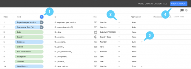
- Create a calculated field: you can use this to create new metrics based on a formula that transforms one or more existing metrics. There are dozens of operators available, here is a reference list.
- Field type: choose the formatting and the type of your metric. Here are the top level types, each has a bunch of options: Numeric, Text, Date & Time, Boolean, Geo.
- Field aggregation: choose the aggregation that should be used for your metric. For example, if your metric is a ratio such as Conversion Rate, you should use Average, if it is an absolute value such as sessions, you should use Sum.
- Create a report: let the fun begin!
Before we dive into the Reports, I would like to focus a moment on the beauty of how Data Sources work. It is not just the fact that you can bring data from other systems that count, it is also how you can use them. One of DS capabilities I like the most is the fact that you can use Data Sources in three different levels:
- Report level: The highest level component in the Data Studio inheritance chain. By attaching a Data Source to a Report you will be able to use it across all pages; it is possible to have multiple Sources attached to a Report, but you will choose one as the default, in case a Data Source is not set in the Page or Chart level.
- Page level: A component of a Report. By setting a Data Source to a Page, you can make it the default to that specific page, even if another Data Source is set as the default in the Report level.
- Chart level: A graphical representation of data within a Page, the lowest level component in the inheritance chain. The flexibility to set Data Sources to specific Charts has a great advantage when building dashboards for multiple websites, countries, business units or departments.
Now it is time to wear your oldest Marvel (DC is OK too) T-Shirt and roll your sleeves. Let’s discuss some visualization capabilities and best practices to start filling your canvas.
Reports: Visualize and Collaborate
After you create a Data Source, you will be given the option to create a Report right from there (see #4 in the screenshot above). But more often than not you will log in to your Data Studio account and create a Report right from the overview page. You will find the “+” on the bottom-right corner, click on it. The best way to start understanding the Reports interface is by reviewing the excellent map published in the Data Studio Help Center (you will find yourself having this Help Center for breakfast, lunch and dinner, it is an awesome resource!) The descriptions following the chart are a simplified version from the link above.
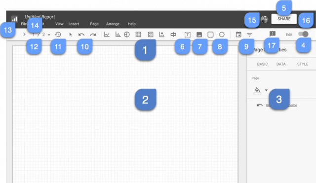
- Click on one of the chart tools to draw a chart in your report
- Your canvas, enjoy!
- Configure data, settings and styles for any selected component.
- Click to switch between edit and view mode.
- Click to share this report.
- Add text to your report.
- Add an image to your report.
- Draw a shape in your report.
- Add a date range control to your report or a filter control.
- Undo and Redo.
- Mouseover to see data status and click to update the cache.
- Switch between Report pages, organize / add / remove pages from the report.
- Back to Homepage.
- Click to change the Report name.
- Shows who is viewing or editing the report.
- Click to manage your Google profile.
- Click to send us feedback (do it!)
Wow, that’s a lot of fun, and we barely started! And before we dive into best practices, I would like to reinforce #15 above. Once you create a Report you can share it with your colleagues to harness the collective knowledge of your company. This is a really big thing! Below is an example where I am collaborating with my colleagues Tahir and Lizzie on a Report (they are really skilled data analysts!) As you can see, I am editing the top line chart while Lizzie (pink) is editing the donut chart and Tahir (turquoise) is editing the map. The cool thing is that you can actually see all changes in real time.

Reports Best Practices
Since there are so many options available, and so many options within those options, I can’t possibly go over everything; so I will discuss some best practices I believe are critical to any Report. Data Visualization is an extremely rich world, I will not discuss fonts, colors, shapes, and charts in depth; since so many smart people already wrote about that, I am taking it as a given!
“In many ways, visualization is like cooking. You are the chef, and datasets, geometry, and color are your ingredients. A skilled chef, who knows the process of how to prepare and combine ingredients and plate the cooked food, is likely to prepare a delicious meal. A less skilled cook, who heads to the local freezer section to see what microwave dinners look good, might nuke a less savory meal. Of course, some microwave dinners taste good, but there are a lot that taste bad.” Nathan Yau, Data Points: Visualization That Means Something
I am going to use the Page below as an example to 5 Best Practices I find can be used in a majority of Reports, but YMMV.

1. Filter controls give power to the users
Filter controls are like coffee with chocolate, they will drive your users forward and offer a rich analysis experience. If you choose the right filters and design them well, analysis will be easier and more effective; there is nothing more frustrating than doing an analysis and being limited by the lack of filters. “So how should I design my filters?” Said no one ever. But I am glad you asked now! 🙂
I always invest some time in understanding the “foundational” dimensions of the Report and each Page separately. Ideally, you would want to have a set of constant filters across all your pages, so that the user can feel more comfortable when looking through the data, but this is not always possible… at least try to keep the same look and feel and some of the same filters. In the screenshot above, I used the same set of 5 filters across multiple Pages (see also #2 below). In terms of design, I like the “Expandable” option, IMHO it looks nicer, but for short lists it might be useful to have the standard filter.
Here is a great video describing this feature in detail.
2. Headers and page dividers are great for organization and consistency
To reinforce the point above on having a consistent experience across pages, I think a header can be very effective on a multi-Page Report. Not only it brings a consistent experience to users, it also informs them what data is available in a specific Page quickly. The header doesn’t need to be too complex, maybe a full-width strip with light background (as above). It can also include important messages to users, links to other resources or even a date picker (if you run out of space). Edward Tufte termed the importance of consistency in design as “economy of perception results“:
“(…) once viewers decode and comprehend the design for one slice of data, they have familiar access to data in all the other slices. As our eye moves from one image to the next, this constancy of design allows viewers to focus on changes in information rather than changes in graphical composition. A steady canvas makes for a clearer picture.” Edward Tufte, Envisioning Information
Page dividers can also be highly effectively to separate between different types of content. For example, if you are showing data for 4 different business units in a Page, you might consider having page dividers to make the separation clear. But again, make sure they are consistent across pages.
3. Chart diversity makes the report more engaging
When it comes to the charts themselves, diversity is a very positive factor; a Report containing only tables or only bar charts is a bit boring to look at for too long. Having different chart types makes the analysis more interesting. Of course you should still use line charts for trends, bar charts for group comparison, and tables where the value is important, but try to include some diversity in each Report… The Chart Chooser is a good resource on how to choose the type of visualization you need for your data.
4. Color styling helps guiding the eyes
Do not overuse color! Nothing states that more succinctly than Tufte’s Data-Ink Ratio:
“A large share of ink on a graphic should present data-information, the ink changing as the data change. Data-ink is the non-erasable core of a graphic, the non-redundant ink arranged in response to variation in the numbers represented.” Edward Tufte, The Visual Display of Quantitative Information
In the example above, I used color to indicate which charts are most important and show the most interesting insights, making the top half of the chart colorful and the bottom half in shades of grey. I think this helps directing the eye. I also used only 2 colors which is usually not enough, but personally I find more than 5 colors hard to read.
5. The Report purpose informs the design
In addition to the above, it is important to remember that the purpose of the visualizations is incredibly important during the conception and creation of your Reports. You must think about the purpose as a whole: what are your users looking for and how to convey it in the best possible way? Stephen Few summarizes this very clearly:
“When you use tables and charts to discover the message in the data, you are performing analysis. When you use them to track information about operational performance, such as the speed or quality of manufacturing, you are engaged in monitoring. When you use them to prepare for the future, such as in budgeting, you are planning. When you use them to pass on to others a message about a business, however, your purpose is communication, no matter what the content. All of these are important uses of tables and graphs, but the process that you engage in and the design principles that you follow differ for each.” Stephen Few, Show Me the Numbers: Designing Tables and Graphs to Enlighten
Sharing is caring: in moderation!
As you will probably notice, Data Studio uses the Google Drive sharing model, which you are hopefully acquainted with. It is important to notice that when you share a Report or Data Source with a person, the access will be given unrelated to whether the person has access to the data in Google Analytics, Sheets, BigQuery, etc. This means that it is extremely important to make sure that the data can be shared with the person.
Sharing data is great, but only when the right people have the right access to the right data.
Let’s look at an example
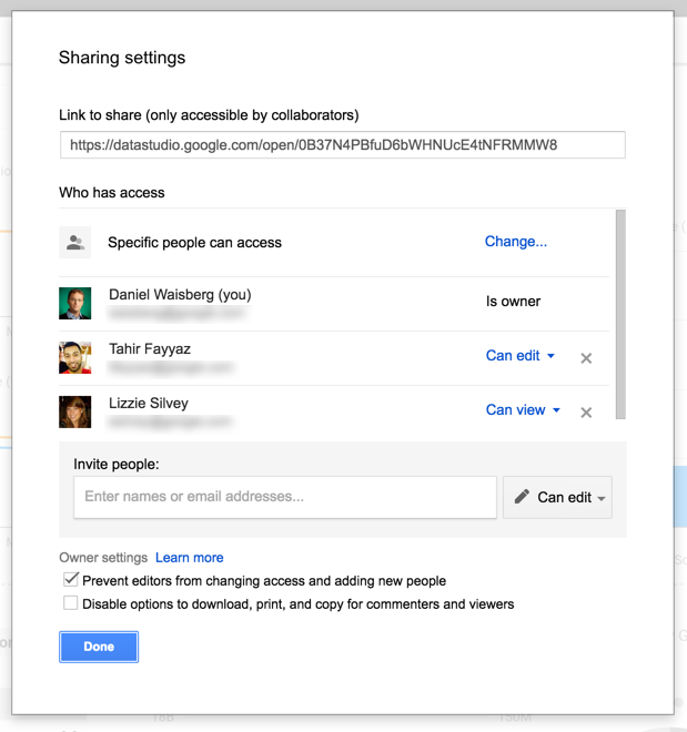
In the sharing settings above, you will notice that three people have access to the report in question. I am the owner, Tahir can edit and Lizzie can view the Report. You will also notice in the first checkbox at the end of the settings that even though Tahir can edit, he will not be able to add new people to it. Also note that I can disable the options to download, print, and copy for commenters and viewers (in this case Lizzie).
Closing Thoughts
Wow. I have been playing with Data Studio for a while now, and as you can see I am pretty excited about it. I think this is a great opportunity to bring the Analytics community one step higher, improving the data reporting and visualization standards. Through Data Studio we will be able to broaden the horizons of our community, bringing more and more people into the data world. If you got this far, I am guessing you are quite excited about the Data Studio and the industry in general.
Data Visualization reading suggestions
- The Visual Display of Quantitative Information by Edward Tufte
- Envisioning Information by Edward Tufte
- Show Me the Numbers: Designing Tables and Graphs to Enlighten by Stephen Few
- Now You See It: Simple Visualization Techniques for Quantitative Analysis by Stephen Few
- Visualize This: The FlowingData Guide to Design, Visualization, and Statistics by Nathan Yau
- Data Points: Visualization That Means Something by Nathan Yau
Happy visualizing! 😉

