SEOs of the world, rejoice! Google Data Studio has a new connector to bring Search Console data into the tool. This means you can start reporting your search data alongside other data sources in the tool. I am sure people will find all kinds of cool stuff to do with it!
Please note that this is not a replacement for the Google Analytics (GA) <=> Search Console (SC) integration. In that integration you will gain insight into your customer behavior by merging GA and SC, here you will be able to visualize it alongside GA and other sources, for example Google Sheets, which might be extremely helpful if you manage your SEO efforts in a Sheet.
A few months ago I published a sample Data Studio report on the GA blog showing how I use it for Online Behavior, focusing on GA data. In a previous life, I used to be responsible for SEO on a large user generated content website… so I thought it would be fun to wear my SEO hat (pun intended) and try building a good dashboard based on Search Console data.
In this article I will present a new page I created in that same report using the Search Console connector. Below I discuss each of the elements I created, but you can access the full report to play with it (you can also click on ‘Use template’ to create the exact same report with your own data).
Search Console data available through the Connector
Once you connect your Search Console to Data Studio (see instructions) you will have two different tables to connect: Url Impression and Site Impression. The main difference between the tables is that the Url table has the Landing Page dimension, while the Site table has the Average Position metric. Here is an image showing the schema for both (read more on the SC Help).
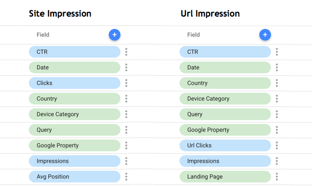
I recommend you create two separate sources, one for each table; this will enable you to use them alternatively in the same report, as I did below.
Header: Dates, Filters and Overview
I always like to include a header in my reports, especially when they have multiple pages. I think headers help “data consumers” to understand where they are; I also think it is helpful to provide some important stats in the header, some kind of tl;dr.

For Search Console data, I believe the most important dimensions to segment by are Country and Device, as they can bring insight into how to optimize SEO efforts (I used filter controls for that). When it comes to metrics, I showed Impressions, Clicks and CTR for the last 28 days (the report default) compared to the previous period (I used scorecards for that).
Impressions and Clicks trends over time
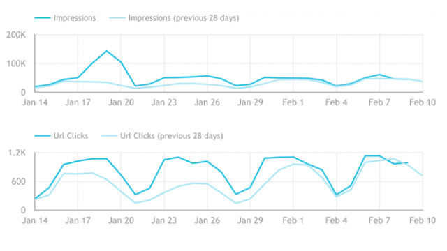
Trend lines are arguably the most effective type of chart, it shows how metrics are changing over time. In this case, I chose to looks at both Impressions and Url Clicks (same as above, last 28 days compared to previous period), I think those two metrics give a good indication on how well the site is ranking on Google (Impressions) and how well it is managing to convert those impressions into website visits (Url Clicks).
Note that in the chart below there is a strange spike in Impressions, which was not followed by an increase in Url Clicks, that is something I should analyze further; maybe Online Behavior started ranking for a query that I am not doing a good work to convert into Url Clicks?
I have not included it in this report, but I think there is a place for adding a chart with a Google Analytics data source showing how many conversions the website got from Google Organic. This would close the loop.
Countries and Devices comparison
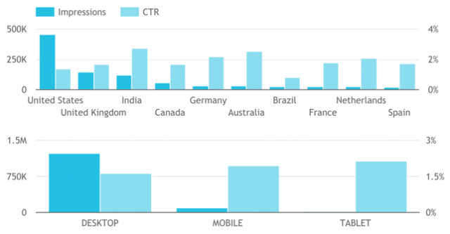
As I mentioned earlier, as far as I understand Countries and Devices are important dimensions that can help uncovering interesting SEO insights. For example, in the chart below it is clear that while the US is leading when it comes to Impressions, the UK and India (2nd and 3rd) have a significantly higher CTR. Looks like Online Behavior snippets are working better for those countries…
Queries and Landing Pages performance
The charts above are a good way to track SEO perfomance, but at the end of the day, it is important to drill down into Landing Pages and Queries to understand what is working well and what needs to improve.
Landing Pages
Landing Pages show, for any number of queries bringing traffic to them, how well the content did in terms of Impressions, Url Clicks and CTR on Search. For example, in the table below we can quickly see two “anomalies”:
- Actionable SEO page (red square): this page has the 2nd highest amount of impressions but almost no Clicks, resulting in an extremely low CTR. The reason might be an overly technical meta description, creating a very unattractive search snippet.
- Data Visualization page (green square): this page has a very attractive title and description, which may be contributing to a very high CTR
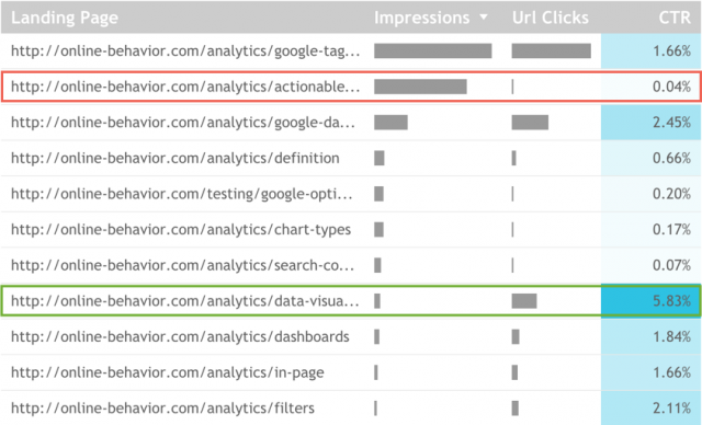
This table can only be created with the Url Impression data source.
Queries
Queries have always been the main focus of SEOs, probably because it is the easiest to explain: you rank #1 for ‘best analyst in the world’! From my shallow knowledge of SEO, I understand that this statement cannot be used anymore, as a query doesn’t have an absolute ranking anymore, it depends on a series of factors… hence the metric Average Position. But that doesn’t make it less interesting or important, Query is still a very actionable and important dimension.
The table below also shows two very clear “anomalies”:
- google analytics: while it shows the highest number of Impressions and quite a good Average Position, this query shows an extremely low number of Clicks. Something is not right here 🙁
- google tag manager: while the Impressions are smaller and the Average Position worse, this Query shows an amazing number of Clicks. GTM FTW!
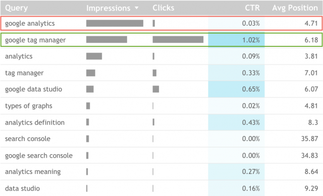
This table can only be created with the Site Impressions data source.
Closing Thoughts
This article is just a quick overview on what you can do with the Search Console data connector on Data Studio. I tried to showcase all metrics and dimensions and bring them to life with examples. However, the greatest power of Data Studio is that it enables professionals to see data from multiple sources side by side, so I am interested to see how businesses use it in different ways. If you are doing something cool with Data Studio drop me a line.
Happy visualizing!

