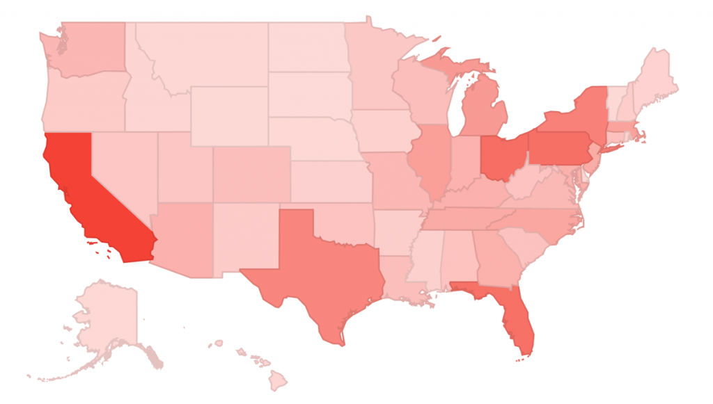
The US Federal Elections Commission (FEC) has been publishing Political Campaign Finance data for years, but they haven’t made it easy to explore their data. Luckily, Google Data Studio and BigQuery are making it easier than ever to explore large datasets like the ones published by the FEC.
In this article, you will learn how to use Google’s latest tools to create your own dashboards, using an example I created to visualize 2016 Election Cycle Donations, exploring public FEC data curated by OpenSecrets.org.
Since there are already a bunch of tutorials for creating charts and filters in Data Studio, we are going to take a small shortcut by making a copy of the original 2016 Election Cycle Donations dashboard, but we are not totally cheating because we have a fair amount of other stuff to do. Here’s a quick overview of the game plan:
- Create a Bigquery account (3 Minutes)
- Add the public FEC dataset to your Bigquery account (30 Seconds)
- Make a copy of the 2016 Election Cycle Donations Dashboard (30 Seconds)
- Create Custom Dimensions and Metrics (5 Minutes)
- Fix Broken Dashboard Widgets (3 Minutes)
- Explore the data!
1. Create a Bigquery account
Skip to step 2 if you already have a Bigquery account.
You can create a Bigquery account by clicking here. This link is actually a special link that will guide you through the process of creating a Bigquery account, and it will automatically add the FEC data you will need in the next step. Once you create your new Bigquery account, you can skip to step III.
2. Add the public FEC dataset to your Bigquery account
Skip to step 3 if you just created a Bigquery account using the link in Step 1.
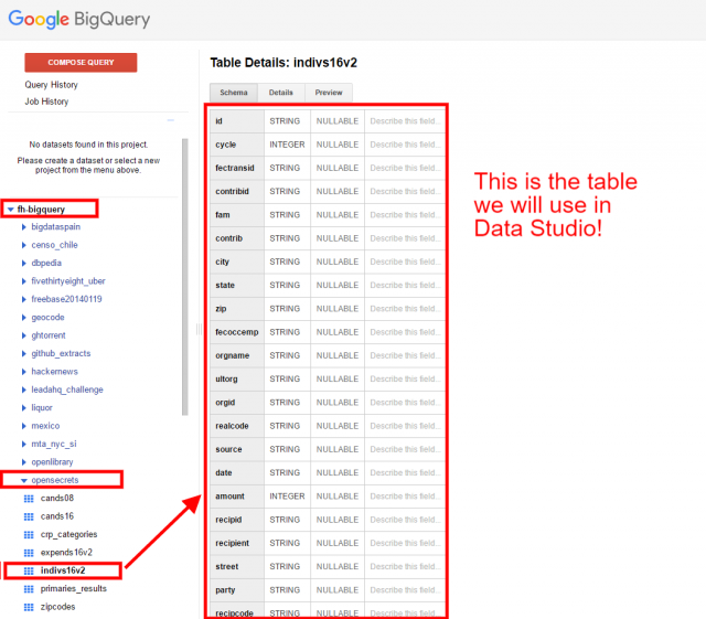
If you already have a Bigquery account, you can click this link to add the public FEC dataset to your account. Once the fh-bigquery dataset has been added successfully, you will see it in the sidebar navigation menu.
3. Make a copy of the 2016 Election Cycle Donations Dashboard
Return to the 2016 Election Cycle Donations dashboard and click File > Make a Copy > Create New Data Source
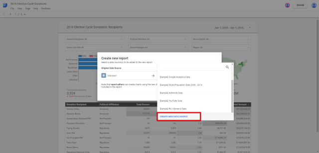
Then click Create a New Data Source and select Bigquery > Shared Projects > enter fh-bigquery under Shared project name> opensecrets > indivis16v2 > your Bigquery project of choice > Connect.
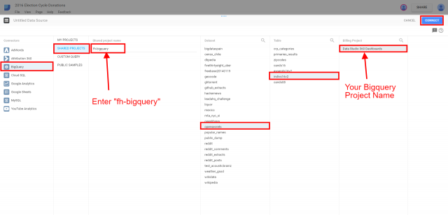
Click the Add to report button on the next screen (we will update columns later)
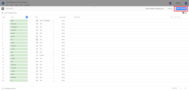
The indivis16v2 BigQuery dataset is now connected so you can click Create Report on the next screen.

4. Create Custom Dimensions and Metrics
The copied version of the 2016 Election Cycle Donations dashboard will show many broken widgets at first. This is because the original version was using calculated fields that Data Studio wasn’t able to copy. We’re going to re-create the fields used in the original Dashboard so we can fix the broken widgets. This part looks like a lot of steps, but it is much quicker and easier than it looks. All we are really doing here is adding new columns and then pasting each name and/or formula we need to define those columns. In some cases, we will just rename the columns instead of adding new ones.
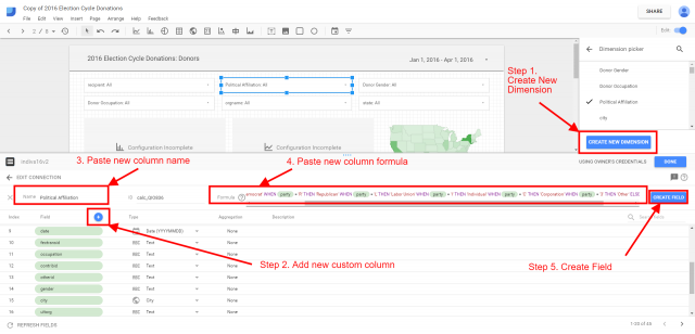
Create new Custom Dimension for Political Affiliation
- Name: Political Affiliation
- Formula: CASE WHEN party = ‘D’ THEN ‘Democrat’ WHEN party = ‘R’ THEN ‘Republican’ WHEN party = ‘L’ THEN ‘Labor Union’ WHEN party = ‘I’ THEN ‘Individual’ WHEN party = ‘C’ THEN ‘Corporation’ WHEN party = ‘3’ THEN ‘Other’ ELSE ‘Not Provided’ END
Create new Custom Dimension for Donor Gender
- Name: Donor Gender
- Formula: CASE WHEN REGEXP_MATCH(gender, “M|m”) THEN “Men” WHEN REGEXP_MATCH(gender, “f|F”) THEN “Women” ELSE “Not defined” END
Create new Custom Dimension for Donor Occupation
- Name: Donor Occupation
- Formula: UPPER(occupation)
Create new Custom Metric for Total Donations
- Name: Total Donations
- Formula: COUNT(fectransid)
Create new Custom Metric for Total Donors
- Name: Total Donors
- Formula: COUNT_DISTINCT(contribid)
Create new Custom Metric for Avgerage Donations
This metric uses the custom metrics Total Donations and Total Donors, so those must be created first.
- Name: Avg. Donations
- Formula: Total Donations / Total Donors
Create new Custom Metric for Avg. Amount
- Name: Avg. Amount
- Formula: amount / Total Donations
- Create column and change to currency format
Create new Custom Metric for Total Donation Recipients
- Name: Total Donation Recipients
- Formula: COUNT_DISTINCT(recipid)
Renaming default columns for more clarity
The following steps do not require custom formulas, we are just going to update the names of a few columns.
- Rename “contrib” to “Donor”
- Rename “recipients” to “Donation Recipients”
- Rename “orgname” to “Donor Employer”
- Rename “state” to “Region” and change format to Geo > Region
- Rename “city” to “City” and change format to Geo > City
- Rename “amount” to “Total Amount” and change to currency format
5. Fix Broken Dashboard Widgets
Now that we’ve re-created the custom columns that were used in the original dashboard, we just need to add them to the broken widgets and we are done. Luckily, any Report Level widget just need a single update to work across every page but there are a few Page Level widgets that need to be updated on each page.
Fix Filters (Report Level widgets)
Let’s assign the following dimensions to each filter so the filters’ names match the layout of the original Dashboard. Use “Total Amount” as the metric for each filter.

- Filter 1: Donation Recipients
- Filter 2: Political Affiliation
- Filter 3: Donor Gender
- Filter 4: Donor Occupation
- Filter 5: Employer Donor
- Filter 6: Region
Fix Charts (Report Level widgets)
Update the 3 charts listed below by assigning the following dimensions to each corresponding widget.

Stacked bar chart
- Add Political Affiliation as first dimension
- Add Donor Gender as secondary dimension
- Use “Total Amount” for metric
Time Series chart
- Add “Total Donations” as first metric
- Add “Total Donors” as second metric
- Add “Total Amount” as third metric
Region Map Chart
- Add “Region” Dimension
Fix Scorecards (Report Level widgets)
Replace the invalid metric for each scorecard with the following metrics.

- Total Donation Recipients
- Total Donors
- Total Donations
- Avg. Donations
- Avg. Amount
- Total Amount
Fix Table Widgets
Unlike the report level widgets we just fixed, the Table widgets on each page contain a unique set of columns. The dimensions and metrics for each Table are listed below.
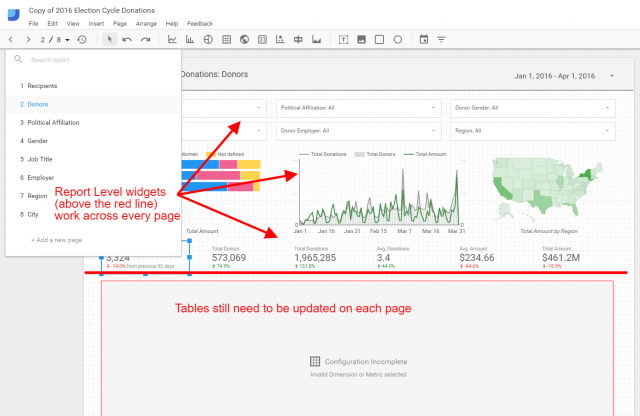
Table on Page 1: Recipients
- Dimensions: Donation Recipient, Political Affiliation
- Metrics: Total Donors, Total Donations, Avg. Donations, Avg. Amount, Total Amount
Table on Page 2: Donors
- Dimensions: Donor, Donor Occupation, Donor Employer, Political Affiliation, Donation Recipient
- Metrics: Total Donations, Avg. Amount, Total Amount
Table on Page 3: Political Affiliation
- Dimensions: Political Affiliation
- Metrics: Total Donors, Total Donations, Avg. Donations, Avg. Amount, Total Amount
Table on Page 4: Gender
- Dimensions: Gender
- Metrics: Total Donors, Total Donations, Avg. Donations, Avg. Amount, Total Amount
Table on Page 5: Occupation
- Dimensions: Donor Occupation
- Metrics: Total Donors, Total Donations, Avg. Donations, Avg. Amount, Total Amount
Table on Page 6: Employer
- Dimensions: Donor Employer, Political Affiliation
- Metrics: Total Donors, Total Donations, Avg. Donations, Avg. Amount, Total Amount
Table on Page 7: Region
- Dimensions: Region
- Metrics: Total Donors, Total Donations, Avg. Donations, Avg. Amount, Total Amount
Table on Page 8: City
- Dimensions: City
- Metrics: Total Donors, Total Donations, Avg. Donations, Avg. Amount, Total Amount
6. Explore the data!
That’s it! All of the widgets across all of the pages should work now, so you are free to explore or to continue creating new pages and finding new insights.
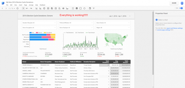
When you think about it, we did not have to write a single line of code, we did not have to learn SQL, and we did not have to index a database or learn how to allocate computational resources… we really didn’t have to do any of the typical scary stuff that usually comes with large scale data analysis! Thanks to Data Studio and BigQuery, almost anyone can now create fully interactive dashboards to explore datasets of virtually any size, and it can be done in just minutes.
By the way, you may have noticed a bunch of other public datasets in BigQuery while we were adding the fh-bigquery dataset. Well guess what, you can actually create Data Studio dashboards with any of those datasets too. You can even combine multiple datasets by creating a Data Source from a query that joins multiple tables together.
As some parting inspiration I would recommend checking out this post by Felipe Hoffa, a Google Developer Advocate. His video about visualizing big money in politics with Big Data has some particularly great nuggets that you can use to take your dashboards to the next level of the game!

