You might have heard a few weeks ago that the Google Analytics team launched Data Studio (DS), a robust platform for reporting and visualising data. If you missed that piece of news, take a look at this step-by-step guide – it’s a great starting point.
DS can be used to visualise a number of different Data Sources, including AdWords, BigQuery, Google Sheets, and others. Whilst all of these bring considerable benefits, in this article I will take a deeper look into how Data Studio can empower your Google Analytics data and focus on how to do the following:
- Bring multiple GA accounts together in one place
- Highlight data for non GA users
- Customise and brand your report to your own style guidelines
Connecting your data
The first thing you’ll need to do when visualising GA data in Data Studio is to create a new Data Source. Below are the steps you should follow:
- Navigate to the Data Source section of Data Studio
- Press the + button (bottom right corner of the screen)
- Select the Google Analytics connector
- Opt for the account that you’re interested in visualising – this will display all the properties that sit within the account
- Select a property – this will display all views that sit within that property
- Select a view
- Press “Connect to data”
On completing step 7, this will display the data schema of your GA data (see screenshot below). You’ll recognise all the GA dimensions and metrics that you know and love from the GA interface and you should also see familiar custom dimensions and custom metrics that you may have created within your GA property.
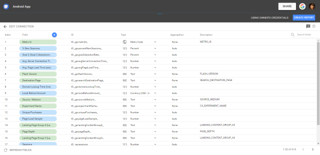
One last thing to do to keep your dashboarding nice and tidy – give your Data Source a name. In this instance, this is my Android app view, so I’m going to label this accordingly.
Congratulations, you’ve now successfully created a GA Data Source!
Now seems as good a time as any to note what I think is one of the best things about using Data Studio (and this is especially useful for those of you who are GA 360 users): the GA connector in Data Studio provides you with the same level of processing and sampling as you would see in the GA interface. So for those of you who have come up against lower sampling thresholds when using the API to visualise data, this will be huge news!
Creating a report
Now we have a GA Data Source all configured and ready to go, we can start visualising the data. We left off looking at the Data Source schema. From here press “Create Report” – this opens up a new tab in the Report part of Data Studio and you’ll be asked if you want to connect this Data Source to the report. Click “Add To Report”.
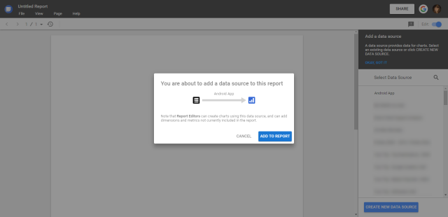
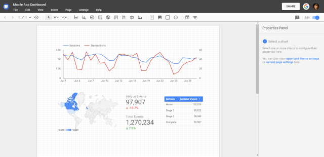
You are now presented with a blank canvas on which to start painting your GA picture. Let’s say you want to draw out a report that looks like the Audience Overview report in GA.
- Add a time series chart and choose your metrics (plot more than one series, if you like)
- Add a geo map to show where all your users are located
- Add something that you are personally interested in – something that you can’t add into the Audience Overview report yourself
- Do you like to get a quick glance at total screen views? Then add a table with screen as your dimension and screen views as your metric
- Is it important that you see how many unique events are firing for a particular event? Add a scorecard that looks at unique events for that one event category
As you can see below, we’ve created something really quite bespoke and we haven’t spent much time doing so – this example below took less than a couple of minutes to build. And moreover, it looks smart, it‘s aesthetically pleasing and it’s personalised to visualise the data that’s most important to you.
For those seasoned users of GA, you are probably thinking “so far Data Studio looks good, but how is this different to the dashboard section of the GA interface?”. Indeed, dashboarding in GA is a great feature and one that is highly adopted (see some examples). It allows you to highlight key figures very quickly and the ability to share these with all your users within the GA account is also brilliant… create a dashboard that your CEO will be interested in and share with them – they won’t need to spend time digging around in the interface thus enabling them to grasp key points quickly.
Data Studio certainly owns similar features, but it extends the capabilities of the dashboard feature within GA. I’m not sure which of my points below is more important but I’ll start with one that I can, personally, spend a lot of time on…
Styling your report
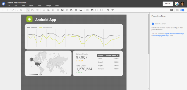
Using the control panel on the right hand side, you can choose to customise and style your reports pretty extensively. You can modify the theme of the page – change the background colour/add banners/choose font – and generally overhaul the blank canvas to your brand’s style guidelines. But you can then get a lot more specific and granular about the style details… select each individual chart in turn and modify the colour of each series, change the colour of the text or move the chart legend around. There are plenty of options to choose from when styling your report, I’ll just highlight a few of my favourite things to do when customising:
- Add a “featured” box (with curved edges)
- Add a logo or photo
- Simplify the look of time series charts by removing grid lines (and even axes)
Adding multiple GA accounts (or other Data Sources) to a single report
We’re now going to look at something which will hopefully prove extremely useful to a lot of data analysts. You’ll need to create a new Data Source to do this, so go ahead and follow steps 1-7 used previously to do so. This time I’ve connected to my iOS GA view (we connected to an Android GA view last time). By creating this second Data Source and attaching it to the same report you’ve already created, you will be able to visualise data from two different Data Sources in one place. Finally(!) you can compare data across GA accounts in a really simple and easy way. Gone are the days of having two different browser windows open with one account open on each. You can now view a completely separate GA account in one, centralised location.
For this, I think we actually want to see a like-for-like comparison of the data across the two accounts so we’re going to resize our current components and move them over to the left hand side of the page. Once settled there, we can then copy and paste them and move the duplicates to the right hand side of the page. Now we can go about changing the underlying Data Source of each chart. By selecting each chart in turn, we can use the properties panel to edit the Data Source being used. If we switch from the Android view to the iOS view, we can immediately see the chart adjust to using this new dataset. Isn’t it great that you can actually copy/paste charts and just change the Data Source?!
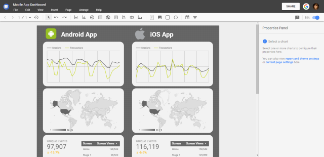
Once we’ve changed each of the Data Sources, we can then very simply stand back and look at the differences between the two apps. Is one performing better than the other? Why is that? Is there an event that’s not firing properly? Is there a particular screen where users are dropping off? Comparing these views side by side couldn’t be easier in Data Studio, and why stop there? You’re not just limited to comparing GA accounts – you can add in data straight from AdWords (using the AdWords connector) or add some data you’ve manually pulled together into a Google Sheet.
Sharing your reports
There is one last thing I want to mention before Daniel tells me this piece is too long for his website 😉 It’s an important one, so very much worth spending some time on.
As mentioned in Daniel’s introductory post on Data Studio, sharing reports is really simple. Using the same functionality you see within Google Docs and Google Sheets, you just press the “Share” button to allow other users to either “View” or “Edit” a report. In addition to these options, there is another way to enable (or limit) users as to what they can see.
Owner’s vs Viewer’s credentials
In the process I’ve noted above, there was one option I missed when setting up the Android and iOS Data Sources. When you get to the schema stage, and before you jump into creating a report, you can select whether you give users “Owner’s credentials” or “Viewer’s credentials”.

If we opt for the “Owner’s credentials” option, this means that the report accesses and visualises the data based on the credentials that are possessed by the owner of the report. So, I have Admin access to the GA account where the Android data is being pulled from. Daniel, however, doesn’t have access to this GA account at all. By setting the Data Source option to “Owner’s credentials”, when I give him View or Edit access to the final report I’ve created, he will be able to see the visualisations in Data Studio. He can filter and query the data to his heart’s content, even though he doesn’t have explicit access within the GA account itself.
However, if I set the Data Source to have “Viewer’s credentials”, the user of the end report would have to use their own credentials in order to see the data. In other words, in the situation where Daniel doesn’t have access to the Android view, he won’t be able to see the data in the report I’ve built. Some error messages will pop up and he won’t be able to filter or query any of the data.
Using these options allows you to share or hide data from those who you wish to have access. These selections are up to you to depict and you can vary them based on the access you wish users to have. Ultimately, this is all about the security of your data and DS gives you a number of options to choose from to ensure your data is only seen by those you choose.
Closing Thoughts
Thanks for getting this far! Hopefully you’ve learned something new and now feel empowered to go and start building out some lovely looking reports in Data Studio. My goal was to show you just how simple it is to connect to GA and from there, indicate how to really make the most of Data Studio’s fantastic features.
Combining multiple Data Sources in one dashboard is something a lot of data analysts need and Data Studio makes this as simple (and quick) as it can be. Now add in the ability to customise and brand your reports and it won’t be long before everyone is asking you to create a report in DS for them. Finally, Data Studio doesn’t forget to ensure all your data is kept away safely, giving you multiple options to decide who views your data and what they can do with it.
Happy dashboarding!

