A few months ago, while checking my Twitter feed during my morning coffee, I came across a tweet from Matt Cutts, a person I respect very much. He linked to an article named Seven Days of Heroin and added the simple message: “this is worth your time.” I decided to trust his judgement and check it out – this decision triggered a 3 month journey to understand the terrible US opioid epidemic, an ongoing crisis that is taking the lives of way too many people.
It was my first serious encounter with the drug and its terrible consequences, and I was quite shocked. I started reading every article I could find and watch every documentary on the web, and as time went by I started understanding a bit more about what was going on. However, something was missing, I couldn’t really grasp the full picture just by reading words and watching videos, I needed to play with data – for me data is the best way to understand trends and patterns of the world around us.
With that in mind, I set out to find datasets that could enlighten my understanding and help communicating the immensity of the problem. After some research, I found three datasets that were useful: CDC Drug overdose death data (US), UNODC Opioids (Global), and FiveThirtyEight Drug use by age (US).
In this article I will discuss some thoughts on the US opioid crisis and how it compares to the worldwide drug adoption and overdose rates. I will present a Data Studio visualization with trends and patterns related to drug usage and adoption – and I will write about each chart separately. If you are interested only in the dataviz, you will find it in the end of the article (and here)!
How do Opioids usage compare to other drugs?
Looking at the FiveThirtyEight Drug use by age (table below), I was surprised by the relatively small amount of Heroin users when compared to the amount of people it kills. I didn’t add to the table the death number for each drug, but Heroin dwarfs all others.
Heroin, when compared to other drugs, is strongly present only among 20-34, maybe as a result of its lethality, maybe for other reason which I could not uncover. But looking at Crack and Cocaine (to compare to strong drugs), we can see a much larger adoption among older age groups.
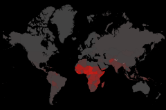
Where does the US stand in global overdose deaths?
Short answer: pretty high! As we can see in the charts and map below, the US leads the pack in overdose deaths, both in absolute numbers and per million people.
Iceland is an outlier with a very small population, so “only” 45 deaths places it very high on deaths per million people. El Salvador, Sweden and Australia also show high death per million, although the last two are less than half the US rate.
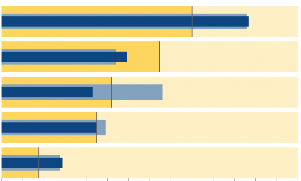
Where are the main focuses of the US Opioid epidemic?
The table below was my “preferred” one, it sheds an interesting light into the US epidemic – it shows where it is already a problem and who are the states with the worst (and best) development trends. Below are some insights we can learn from the table:
- While California is the top state when it comes to absolute deaths, the death rate is around the national average, and there was no statistically significant growth between 2014 and 2015 (last official data available).
- Ohio, Pennsylvania and Massachusetts have death rates more than double the national average and they show extremely high growth rates (statistically significant) – that’s very worrying!
- While there are states that showed a decrease in death rates, none of them were statistically significant 🙁
Closing Thoughts
As I wrote in the introduction, this project took ~3 months (not full months, I also have a day job!), during which I read and watched all I could about opioids adoption, addiction, and overdoses. It was a journey to understand where we stand as a society and how things are developing. Looking back, it really changed the way I see the world around me, how I think about drugs and how I talk about it – it also helped me learn new things about data!
I think this kind of analyses are important in many ways:
- It helps us understand and communicate issues that are important to our society, it is an opportunity for analysts to make a change, to create a better future.
- It is an opportunity to learn new techniques and better ways to communicate data, not just business reports (which are important too, don’t get me wrong).
- It is an opportunity to have some fun with data, a hobby, tackling a challenging dataset brings a new perspective for work related visualizations too.
To conclude, here is a call to action: analysts of the world, let’s use our skills to make this planet a better place, and have fun while doing it!