I have always appreciated the work of the Bill and Melinda Gates Foundation, it is really amazing to see people working so hard to make the world a better place. But I was left speechless when I opened their new report: GoalKeepers 2017. It tells the stories behind the data to help “accelerate progress in the fight against poverty by helping to diagnose urgent problems, identify promising solutions, measure and interpret key results, and spread best practices“.
First and foremost, the goals themselves are superb – I can’t think of more important issues to fight for. But I was also impressed by the information design, it is spotless. They used the right medium for each piece of information: text, images, videos, animations and charts. The report is engaging and, before you realize, you spent an hour going through it. So I was touched both as a person that cares about what is happening around me and as a professional appreciating good work.
Interestingly, a few months ago I was looking for some data to build a sample report, and I chose the maternal mortality dataset from UNICEF’s data portal. I built the report and used it, but didn’t take the time to publish it – ever heard of procrastination? 🙂
In this article I will provide more context into GoalKeepers 2017 using publicly available UNICEF data on maternal mortality. I’ll start with some words about the GoalKeepers 2017 report – then, I’ll discuss some of the steps I used to create my report and the insights I learned from the data.
Stories behind the data: maternal mortality in Ethiopia
One of the highlights that I found particularly interesting in GoalKeepers 2017 was the maternal mortality case study, focusing on how Ethiopia is fighting this terrible issue. Here is how Bill and Melinda define it.
“If you were trying to invent the most efficient way to devastate communities and put children in danger, you would invent maternal mortality.” Bill and Melinda Gates
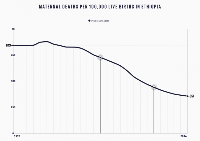
Most people would agree that mothers are probably the most important pillar for a child (I’m a father, and I think fathers are important too, but as my mom always says: “you will never be a mother!”). So it is devastating to learn that in 2015, UNICEF registered 302,530 maternal deaths due to complications from pregnancy or childbirth – 168.7 deaths per 100,000 live births. And remember that a mother’s death does not mean one child left motherless, women can already have many more children when it happens. However, as GoalKeepers 2017 shows, we’ve made some great progress, and the trends look good. In their case study, they show how Ethiopia is taking giant steps on their fight against maternal mortality, and the chart they used is simple and powerful: mortality went from 843 to 357 per 100,000 from 1990 to 2015 – that’s great!
But in order to understand our global status better, it is important to put more context into the mix: what’s happening around the world? And how does Ethiopia compare to other places?
Maternal Mortality around the world
To have a better understanding of how both Ethiopia and the world in general is progressing, I took a deeper look in the maternal mortality dataset from UNICEF’s statistics website. The data is publicly available, well organized, and it seems trustworthy. I downloaded the xlsx file and formated it for Data Studio using this spreadsheet; then, I imported it to Data Studio (learn how). Below you’ll find my data visualization embedded, scroll down to read some of my conclusions based on the data. I know, the horizontal bar chart goes on forever! But I think it gives an interesting perspective.
Disclosure: I do not pretend to be a specialist in global health, my knowledge about the efforts in the area are minimal. The insights below are based on the data only – I’m assuming UNICEF publishes accurate and unbiased data. With that said, I hope it will help people understand better the status and trends of maternal mortality around the world.
Here are my insights on maternal mortality based on UNICEF’s data.
- Amazing progress – but not solved: out of 183 countries in the data, only 13 are worse off in 2015 compared to 1990. The trajectory is mostly good – globally, we saw a decrease from 339 to 168 in maternal mortality rate, an average of 44% decrease. For context, Ethiopia’s rate decreased by 71%, significantly better than the average. However, it is clear from the map that Africa is bleeding, with Sierra Leone losing 1,360 for 100,000 giving birth – that’s very bad.
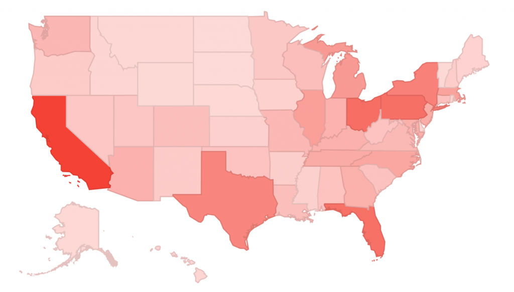
- United States and South Africa have alarming trends: both countries are among the top 10 countries in the ‘getting worse’ table (sorted by 1990-2015 % change) – South Africa had an absolute 1,500 deaths and USA 550, that’s a lot of loss. Even though they don’t have the highest rates, it is quite alarming to see the negative trends and absolute numbers. For more on the USA trend check this article, which discusses possible reasons and links to more in-depth analyses.
- Cambodia and Turkey up-and-to-the-right, but still a lot of deaths: both countries have shown great progress, appearing in the top 10 ‘getting better’ table – but they still need a big push, especially Cambodia.
I think those are interesting points to think about as we continue fighting this horrible issue – the more data (and analyses) we have, the more prepared we will be. If you are looking for a place to start, UNICEF has a lot of interesting datasets in their data portal. Let’s help make the world a better place!