So here’s the deal: you’ve spent a ton of time with your data and you know it inside out. You’ve wrangled, sliced and diced it and are now the expert with this data for this problem. You’ve uncovered new, actionable insights that will lead to fantastic opportunities or improve your bottom line. Great! Time to show your colleagues or your boss or your clients these findings.
You open your data tool of choice, quickly create some charts and make it all look pretty with a flashy color scheme or fancy logos. More often than not, we fly through this final stage and don’t give the data visualization step the due care it needs. This is insane!
Think about it. Your charts and dashboards are most likely the only piece of information your boss or client will interact with. The only information! And yet, here we are, creating default charts and missing the opportunity to really convey our message.
Effective charts are a compelling way to show your data. The human brain is simply better at retaining and recalling information that has been presented visually.
In this article I will discuss several techniques that will help you create more effective charts to communicate the underlying data.There’s no big secret here. However, by applying deliberate thought, a handful of best practices, and allocating sufficient time in projects for the data visualization step, you can make a big difference to the impact of your charts.
Plan your approach
Before firing up your favorite data visualization software, it pays to spend some time thinking about your output and your goals. Start by answering a few simple questions:
- Who is the intended audience?
- What medium will you use to show your charts? (e.g. slides / dashboard / report etc.)
- What is the goal of this project?
For example, consider the audience who will view your chart. How long will they have to study it? How familiar are they with the data? Are they technically inclined? Do they want detailed charts, or quick summaries?
You want to optimize your message to resonate with your audience, so the more you know about them, the more likely you’ll be able to achieve that.
Likewise, how you deliver your message will affect your decisions. Is it a chart in a slide deck? In an informal email? A formal report? An interactive dashboard?
Reports and dashboards are typically pored over for longer periods of time, so charts and findings can be more detailed, whereas presentations or client pitches are short and sweet, where the audience will only have a moment to understand and absorb the information.
Lastly, think about what your end goal is. What do you want your audience to do with the information you show them? For example, if you want your manager to make a cost-benefit decision for a new hire or expensive research tool, make sure your solution answers the question and facilitates making that decision.
Deliberately focus the viewer’s attention
Remember, the point of your visualizations is to communicate information, and you can ensure they do that more effectively by giving prominence to the key message within your chart.
You can do this by using attributes, for example color, to highlight specific elements of your charts and focus your audience’s attention there. These are known as pre-attentive attributes, and they dramatically help speed up the absorption of information.
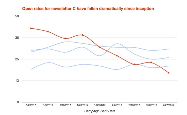
Consider this chart showing the open rates for four newsletters that you manage. There’s an important story in there, but it’s difficult to see with the default colors:
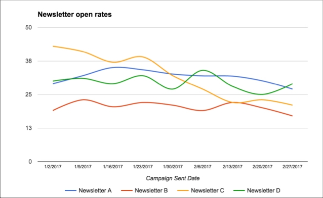
However, by carefully using colors, we can bring that story to the fore:
Add context to aid understanding
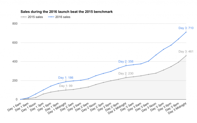
Consider the two charts above, showing email newsletter open rates. The second chart also has a heading that adds context to the story. The words complement the chart and reinforce the message.
Much like writing titles for your blog posts or newsletters, think about the title of your chart in the same way. It should tell the viewer what to expect in your chart and summarize the message.
Similarly, your data may have unexpected spikes or dips, so you might want to use annotations directly on the data points or as footnotes, to make sure the viewers have all the context they need.
Reduce clutter in charts
Renowned data visualization pioneer Edward Tufte coined the term data-ink ratio to convey the ratio of ink needed to tell the core message in your display, divided by the total ink in the display. The idea is to maximize this ratio, in other words, reduce the amount of non-essential ink.
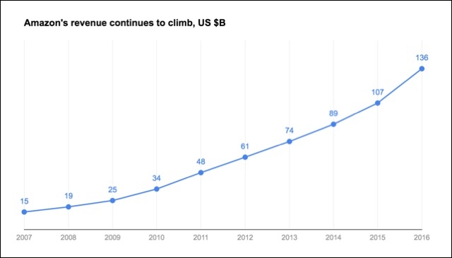
Let’s see that in practice. Compare the following two charts showing Amazon’s revenue between 2007 and 2016:
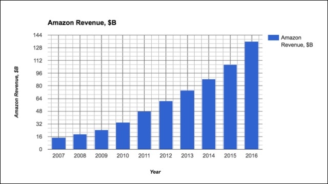
After decluttering, the annual revenue figures jump out at the viewer and the information is much quicker to absorb:
Avoid using overly complex charts for the sake of it
There are a lot of complex chart types out there: waterfall charts, radar charts, box and whisker plots, bubble graphs, steamgraphs, tree maps, pareto charts, etc. etc.
Sometimes these may be appropriate for specific cases (e.g. a Sankey chart to show web traffic flow) but it really comes back to the question of who your intended audience is and what medium you’ll be showing your chart through.
Does this radar chart really communicate your message well? Would a simple bar chart, which is widely understood, be a better alternative?
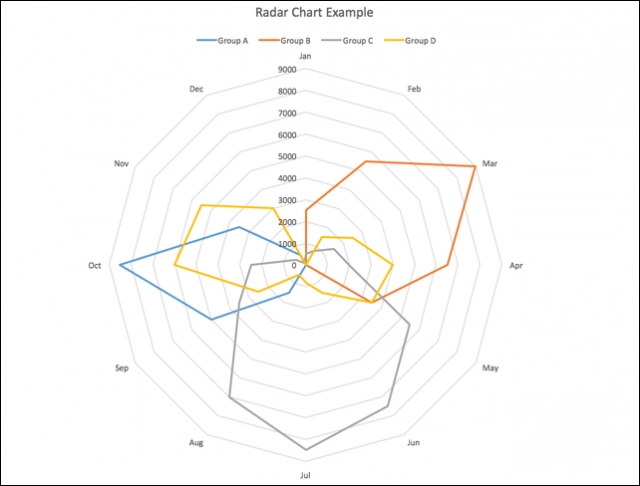
Whenever I teach a dataviz class, I always say that a good chart should be like a good joke: it should be understood without you having to explain it.
Is that pie chart really the best choice?
Pie charts are popular and ubiquitous, but somewhat maligned by the data visualization community. Why is that?
Consider this default pie chart in Data Studio, showing website Sessions broken out by Medium:
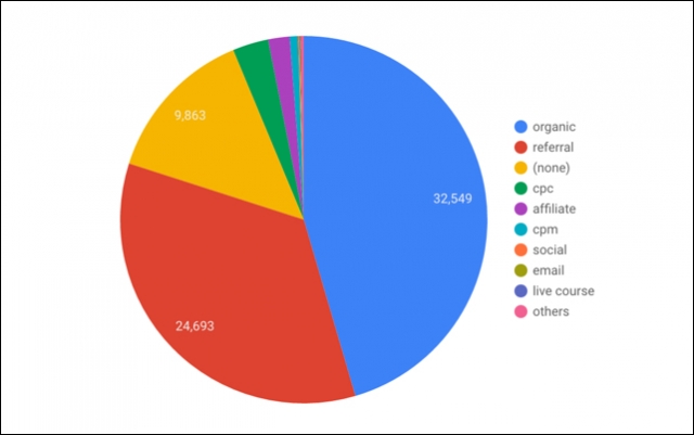
This chart (and pie charts in general), have two main drawbacks: 1) it’s hard as human beings to decipher the relative sizes of the slices (and the order and position of them affects this), and 2) the long tail is unreadable. Plus, the legend is ugly to look at.
A much better chart for data with many categories and a long-tail would be a standard bar chart. Nothing fancy here, but it’s super quick and easy to read off the values, especially for the smaller categories (e.g. compare trying to understand email sessions in the pie chart vs. the bar chart).
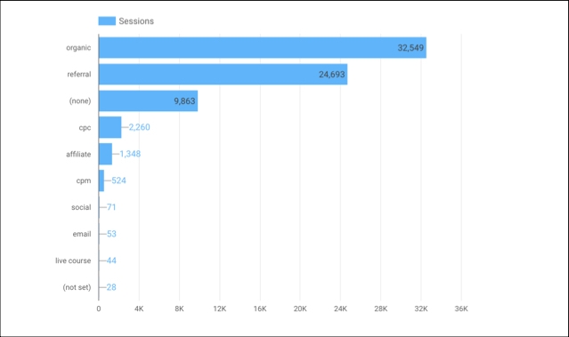
So if you’re going to use them, restrict pie charts to small numbers of categories (I’d advise three or less), and always ask yourself if a simple bar chart or table would suffice and be quicker to read.
Be careful with dual axes charts
Dual axes charts should be used with caution as they often cause confusion. It’s tempting to use them when trying to chart data series with large size differences, as shown in the following image. Which series goes with which axis? Lines that overlap will also confer meaning that doesn’t actually exist, because the series are on different scales.
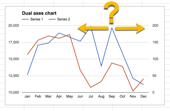
Some strategies you can use to mitigate confusion include matching the series and axes with different colors, labeling the axes clearly and even using different chart types for the different series (line with a bar).
However, I’d still advocate only using them sparingly. It’s often better to show the two series in separate charts next to each other.
When to start the y-axis at 0
For bar charts, you should always start the y-axis at 0 since the height of the bar represents the count in that category. We look at the height of the bars and compare them. If one bar is twice the height of the other, then we’re going to conclude that the value of that category is twice the value of the other category, even if the axis shows otherwise.
Consider this simple example. Both bar charts have been plotted from the same data but they tell very different stories:
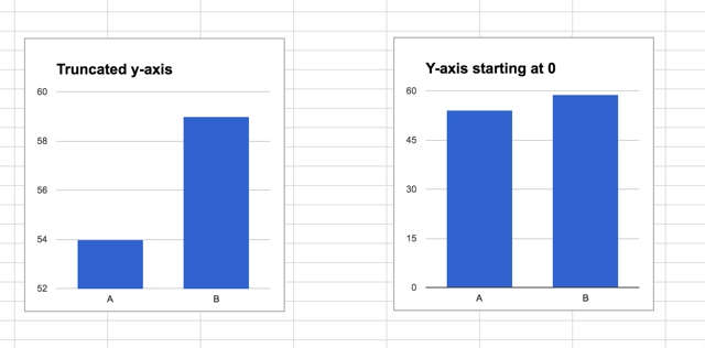
Vox Media created an excellent video about truncating the y-axis. With line charts we don’t need to be so strict with truncated y-axes as the visual lines are used to compare trends, not actual values, as in the case of bars. Indeed you sometimes need to narrow the range with line charts to show the story.
Remember to consider the color blind
Approximately 10% of the male population and 1% of the female population identify as color-blind, and the most common type is Red-Green color-blind. So it pays to keep this in mind when designing your charts.
Closing Thoughts
Once you’ve created your charts, or your dashboard, pause and ask yourself these few questions:
- Is it effective at communicating your message?
- Is it efficient at communicating your message?
- Ultimately, does the audience benefit from seeing your visualization?
There is no single right answer with data visualizations, as it will depend on many of the factors discussed above. People will come out with different charts from the same dataset, all of which could be equally effective. However, by following some best practices and thinking critically about your charts, you can improve them dramatically.
I’ll leave you with some parting words from a master in this field:
“Above all else show the data” Edward Tufte

