“The only fence against the world is a thorough knowledge of it.” ~ John Locke
Consider your world. It is data now. Data is in everything we do. Especially in business. But wait, what does that really mean? Does it mean that you are behind in a race that everyone else is winning and you didn’t know you were running? Maybe! But more likely it means you or someone you are working with is thinking about how data is going to impact them or their business. You may already be doing something and want to do more. You may want more or better analytics or machine learning. You may want a deeper understanding of some aspect of your business.
When you start to search for tools or try to build your own data product, you will be overwhelmed by the options. Any sane person would be. The data industry is a fast growing mess of ideas, technology; old and new. It is possible to dive in, spend a lot of money, work really hard and not get anywhere.
At least to me, that doesn’t sound very appealing.
What you need to do is work out where you are, what you want to do and prioritise a set of actions to get there. You can do this using a SWOT, or set of box and line diagrams if you wish. But as Simon Wardley would recommend, you would do better by understanding ‘position and movement’
Like any great general going into battle, to do this, you need to use a map. Going through the process of Data Landscaping will provide you with a map and a set of prioritised actions that move you towards answers.
What is Data Landscaping?
Data Landscaping gives you knowledge of your world. It is a technique I have developed that can be done very quickly as an individual or in small groups. All you need is a question you think data will help you answer, a pen, and a piece of paper. By the end, you will have a prioritised list of highly actionable next steps to get you started in your data work.
Data Landscaping is not magic, it doesn’t unlock the ‘Secrets of Big Data’ and it won’t set up your clusters, algorithms and processing pipelines.
Data Landscaping is based on a ‘four box matrix’. This is a grid divided by two axis of opposing extremes. You may have met such examples as ‘The Ease / Value Matrix’ or the ‘Urgent / Important Matrix’. If not, they are well worth the research.
Generally any four box matrix should be set up so that ‘Good’ is top right and ‘Bad’ is bottom left. In Data Landscaping the axis are ‘Closeness’ and ‘Lightness’. The horizontal axis goes from ‘Distant’ to ‘Close’ and the vertical axis from ‘Dark’ to ‘Light’. You can see an example below.
The Dark / Light Axis
- Dark data means data that you know exists but are not able to use (Email, archives and server telemetry)
- Light data you know exists and you are able to use in your business (Spreadsheets, web analytics and supplier costs)
The Distant / Close Axis
- Distant data exists outside your organisation and has some distance to travel to be used (Social media, government and research data)
- Close data is data within your organisation and can be used immediately (Media spend, transaction and sales data)
Combined
- Light and Close is where you want data to be. It is the data you have and know how to use.This is most often the data you ‘start with’. While very useful, it can often be the least surprising data sets. This data has well understood value and can be described as business critical.
- Distant and Dark, the opposite side of the map, is the the data you know nothing about and you don’t know how to get. When most data projects start it is considered a distraction. Thankfully, data landscaping gives you an opportunity to discuss these data sets and avoid glossing over potential value.
- Dark and Close is the data you know you have but you don’t know how to use. Especially with the cheapening of storage media and the emergence of ‘Big Data’ as an industry, many organisations decided to ‘capture everything’ even if they didn’t know what to do with it upfront. Often these data sets are aspirational. Organisations that have them would be happy to develop new insight or revenue from these data sets but don’t know how.
- Distant and Light is the data you know what to do with but don’t have. These data sets are the ones organization’s desire. You may have overheard ‘I wish I knew where our customers lived’,’Do we know which roads our delivery drivers use most often?’, ‘I wish we could afford to run a survey to find out what people really think’. These all describe Distant Light data.
A little bit of history
While Data Landscaping has been developed to fill a gap in data understanding, it has been inspired by the work of others. Here are two examples.
1. Gartner
In his Gartner paper from October 2012, Big Data Strategy Components: Business Essentials, Douglas Laney describes 5 types of data that represent potentially valuable sources for a business.
- Operational Data – Readily available data typically in databases
- Dark Data – Data that remains in archives logs or is not generally accessible
- Commercial Data – Syndicated data from the likes of Nielsen and IRI
- Public Data – Published governmental data
- Social Media Data – Captured data about participation by individuals and businesses in Social Media
You can see them plotted against our axes here:
2. Simon Wardley
Simon Wardley has developed a technique known as Value Chain Mapping (great resources can be found at Wardley Maps and on his blog). They key to a map, of any kind, is that it shows you position and movement as opposed to just a state or, at worst, behaviour.
In the case of Data Landscaping, once you have identified where your data sets are in the quadrants you have a sense of position. Next, you consider movement.
Moving data between quadrants
The goal of moving data is to get it into the Light / Close quadrant. This means you have the data and you know what you are going to do with it. In general there are two kinds of action that move data sets on the map: Access and Education.
1. Access moves data from Distant to Close
Access actions are most often financial or technological. Financial actions are simply the purchase of data but can also involve an investment in matching, integrating or uniting teams or technologies. Technological actions are the implementation of acquisition, ingest, integration or unification, matching and storage technologies. This can be as simple as learning how to call a programmatic web API on demand to setting up an automated data pipeline.
Other access barriers can include data quality and trust. If data is poor quality users might reject the data and block the value expected from accessing the data.
Access actions have the clearest value to an organisation. They are easiest to ask for and often come with a well understood return on investment.
2. Education moves data from Dark to Light
Education actions teach people what data contains and how it can be used. Education can be as simple as reading documentation, press releases and searching online. These actions can also include training courses and experimentation. Data sources that provide a well defined data product often come with the best documentation and the easiest education actions. Data that was ‘just collected because it seemed like a good idea’ often have the most complex and challenging Education actions. Often a large amount of experimentation is necessary to discover the value within dark data.
Education actions have a less well defined return on investment, especially as they relate most closely to aspirational data sets (those in the Dark / Close quadrant). Often a ‘self starter’ will investigate the possibilities of a data set, then will evangelise it’s use within an organisation.
Interestingly, quite often Dark / Close datasets become Distant / Light after education because access considerations are one of the things that were not known.
There are many ‘Tools’ available for working with data. Tools both assist with Access actions and Education actions. When deciding which tools to invest in it is important to understand which kind of movement they are creating. As with the actions themselves, it is easiest to understand the value of tools that give you access to data you knew you wanted. However, it is possible that when you receive the data it is much ‘Darker’ than you were hoping for. Similarly, tools that help educate people about data sets but don’t provide any improved access can be frustrating.
How To Build a Data Landscape: An Example
Business X does not sell directly to their customer, but has a strong brand and sells their products through large retailers and supermarkets. Their product has a strong association with health and vitality. As part of their marketing activity they want to create a ‘honey pot’ of content for sharing in social media. This will include advice videos, motivational images and articles. This content is categorised, themed and carries keyword tags to help users find it on their site and through search engines.
To understand the effectiveness of this strategy they want to answer the following questions through data:
- What content is available on the website?
- How much traffic each type of article gets?
- Which articles are shared the most?
- The sales of the key brands promoted?
The data landscape applied to the given model looks like this:
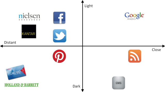
The company has implemented Google Analytics on the honey pot site and can see traffic to various articles. This puts Google Analytics in the Close / Light quadrant. However, because of the structure of the website the details and content of the articles themselves are not available within Google Analytics. The company knows that the content is generated in a CMS but this is a bought-in system and they do not have direct access to the underlying data. This makes the CMS data Close and Dark. They do know, however, that an RSS feed is available that provides the data required. The data as RSS is therefore lighter and closer than the CMS – however they don’t know how to use it as data.
The company built into the CMS a share button and configured it to allow sharing to Facebook, Twitter and Pinterest. Each of these systems gives out some form of data. Twitter and Facebook have well developed APIs for data or insights. In the case of Twitter, there are tools that allow deeper analysis beyond the API provided by Twitter. Pinterest does not provide a similar service at this time. This puts Facebook and Twitter on the light side but distant from the company and Pinterest on the dark side of the line. Google Analytics is also able to track the ‘click’ on the share buttons for each site.
Nielsen and Kantar provide volume and penetration data about the products in question, but the data is quite expensive to access so is more distant than Facebook and Twitter. The company also knows that Tesco and Holland & Barrett have data about the sales of their product but no idea what they could use it for or how to get access. This makes these two sources Distant and Dark.
The company can start getting insights about their strategy now because they have a Light and Close source (Google Analytics). Educating an analyst in what is available in RSS will move this data Closer. However, based on the technical capabilities of the organisation it is likely to get more distant because RSS is not a useful data format and needs processing to be useful to an analyst.
Similarly, reading the documentation on the CMS will help lighten this data. Again, it is likely to push it more distant because it will be locked into the way the CMS works. If the RSS is complete, this may not be needed.
Connecting to the Facebook and Twitter APIs, or using another appropriate tool, will give access to data from these sources and allow the analyst to understand how articles are shared further.
To understand sales impact, the company can decide to pay for Nielsen or Kantar data to bring this data closer. Alternatively, they could contact the retailers directly about any data products that are available. It is often possible to barter for data as part of the wholesale process.
The further the data source has to move towards Light and Close the more investment is needed in access, education and tools.
Getting started
There is no real trick to getting started: draw the axis on a piece of paper or whiteboard and lay out what you know. To get the maximum benefit from the framework you should be brutally honest with yourself and ask questions such as: Is data from a source really as Light and Close as it could be? Do I really know what is available from public data? Do I need to invest more in education, at this stage, than access or tools?
Data Landscaping should be done quickly. There is little point in agonising over the exact positioning of a piece of data. As long as it is relative to the others on the landscape – that is fine. Also, for your business the exact definition of Dark or Light might be different from others. The key is to have the discussion and agree the relative position of items of data.
The next step is to prioritise a list of actions that will move data closer and lighten it for your business. It is easiest to focus on small movements first and, as you get comfortable with the process of moving data, you can dig deeper into what is available.
The breadth and richness of data sources available is ever increasing, Data Landscaping is designed to help stopping this becoming overwhelming.

