Competition on the contemporary web is enormous, website usability is crucial as never. If a website is complicated, people will leave it without thinking twice. If it is not understandable, people will find something simpler. If information is hard to read, people will find something better. It will take no more than 10 seconds for visitors to decide whether to stay on your site or not.
According to the International Organization for Standardization (ISO), the definition of usability is:
“The extent to which a product can be used by specified users to achieve specified goals with effectiveness, efficiency, and satisfaction in a specified context of use.”
Even if you have the most compelling content and the most beautiful design, the interface usability must always be kept in mind. Visitors like being taken care of. So before getting to optimize your website usability, ask yourself the 5 questions discussed below, it will help you define the key aspects you need to start from to improve your website usability.
1. Can you guarantee a high speed for your web page?
The answer to this question must be a cornerstone of your usability optimization. All your further efforts can simply be useless if you cannot provide a descent loading and operation speed for a web page.
This includes server characteristics, network quality, server location, complexity of the page itself (JavaScript, large images, etc.), caching, and many more.
Performance speed cannot be overstated. Even the world’s best web page user interface will be a failure at low speed. Users usually don’t wait for more than 4-5 seconds before the page loads. They just leave.
For insights on how to improve your website speed check Google’s PageSpeed Insights.
2. Is everything clear? Can you make it simpler?
Simplicity is the key to your visitor’s hearts. Everything must be as simple as possible. Take it as a premise that ALL of your visitors are incredibly lazy. They don’t want to make any complicated actions, fill in any forms, and learn how to use your page. They want it right here, right now.
Get rid of anything that is needless. Be brief, laconic, yet descriptive.
Making the interface of your webpage self-explanatory is essential, no assisting text and guides will help. Usually users don’t read, it must be clear what to do and how at a glance.
If the visitor has to learn anyway, the learning process must be as short as possible and easy memorable for the further visits. Here is a good example of simplicity.
3. Is your navigation good for others?
Resulting from simplicity of the page in total, this question stands alone. Navigation must be easy and understandable. At any furthest corner of your website it must be 100% clear, where you are, what you can do here, and where you can go from here.
One of the most important navigation features is the search box. It must be available from every page of your website without excessive actions.
Speaking about the main page. It is essential that you enable your visitors to get to your main page from any place, just as the search box. Remember that not necessarily all the visits to your website will start via the homepage, so there must be a link leading to it. A common decision is to have the page logo with a link to the main page in the top left corner.
There are many discussions about basic usability ‘3 click rules’ on the web. There has been researches disclaiming it. Yet the less clicks (or actions) a visitor has to make to achieve his goal the better, so don’t make obstacles for visitors. Try to avoid “signing up” or “login” screens before viewing your content.
4. Is your content readable?
This is another fundamental issue. Great content can be shaped so poor that no one will cast a glance on it. The recommended shape for page content is F-Shape. These results from eyetracking research of how people read pages. Main attention is given to top and left parts. Top left corner gets the first attention.
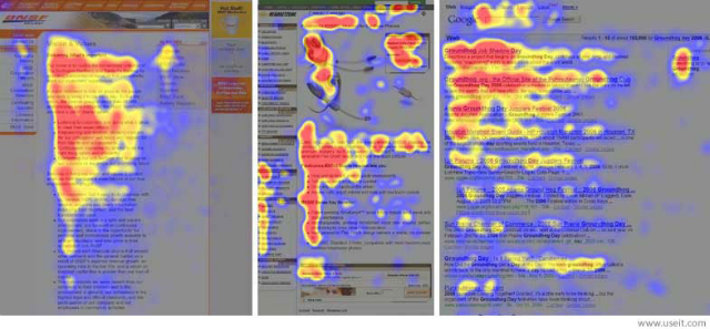
A good choice will be to place the navigation or other important components to the left or on top of the screen. People who read from left to right from their very childhood will surely drop their first look at the left part.
Think about the adequate text-to-background contrast for good text readability. Mark headlines so that they separate text into good looking blocks, easy to conceive. Headings should be clear and descriptive. Leave more free space, let the visitors breathe easily.
5. Forgot about mobile design?
It is important to know that for the last years there has been an incredible growth of traffic from mobile devices such as tablets and smartphones. Mobile phones and tablets now account for 1 in 8 US Internet page views and keep growing (source).
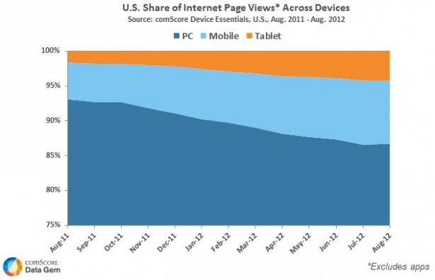
This means that if you make your website available from a mobile device, this may add another 13% to the number of your visitors. Maybe you should consider responsive design or a mobile version of your page. Anyway your website must be accessible and clear at smaller screens and usable at touch screens.
Making an awesome website requires a huge work, and it is impossible to account every possible factor. There is always place for improvement. But now you at least know where to start from.

