This article walks you through GA Effect, a web application that helps you identify whether events happening on your Google Analytics data are statistically significant or just pure chance; in other words, it separates signal from noise.
I will focus here on how to use GA Effect and interpret the results, but if you are interested in building your own online statistics dashboard using R, take a look at my previous post, where I explain how this application was built.
Is This Event Statistically Significant?
You may recognise the situation: you’ve implemented some SEO improvements 3 months ago and you’re now checking if and by how much your revenue has improved since then. You log in to Google Analytics, but instead of a huge peak of SEO traffic, you are instead greeted with a slight hump. You think it may be due to your efforts, but can’t definitely say. The marketing team is saying the increase is due to a display campaign they did 6 weeks ago that influenced your brand search, but you think otherwise, and you need to prove it to justify releasing budget for more SEO work.
Or how about this: you’re in charge of a travel website, and your country has just won the Eurovision song contest. Everyone is saying this is great news for the country’s tourism and you should see an increase in bookings. Could you judge if this is the case, or is any increase you see that year just due to seasonal variation? Maybe its just the weak currency?
What both these scenarios have in common is a certain event happening, which may or may not have had a positive effect. Wouldn’t it be nice to know for sure that the event was significant, backed up by more than just instinct or opinion? That way you could be more data-driven regarding future investments. Further, if you do find that event to be significant, it would be nice to have an idea of how much it moved the needle, so you can judge its overall value and ROI.
The situations discussed above are great examples of what GA Effect attempts to answer using a Bayesian structural time-series method. It provides a Yes or No answer to the question “Is this event significant?” The tool also gives a metric value to those events.
How GA Effect Works
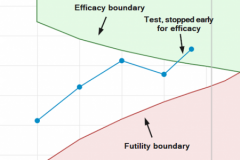
GA Effect is coded in R and takes advantage of the CausalImpact package released in 2014 by Googler Kay H. Brodersen. The package uses Bayesian structural time-series to build an estimate of what your metrics would look like if no event happened, and then compares that with what actually happened (image below from official package page). If the model is correct, then by comparing the differences between its estimate and reality, you can get an educated guess of the event’s value.
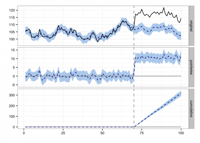
If you were looking to do similar analyses without Bayesian time-series, a sensible approach would be to take the average value before the event, and compare it with the average afterwards. The CausalImpact model builds on top of that by using Bayesian statistics to give you a better guess at those averages, as well as accounting for season and time.
The statistical significance tests are set to 95% confidence level. That is to say, if you do find significance, an experiment run 100 times is expected to see the impact 95 times. This means that if all your assumptions are correct, you can be a lot more confident in that event’s effect. Bear in mind several assumptions need to hold for this to be the case, which we discuss later – not following those assumptions may give you incorrect results.
Use Case: Impact of SEO Changes
The two examples discussed previously were used to test the app, along with a few others. Below I will discuss in detail how GA Effect was used to analyze the impact of SEO changes on a website.
It is important to keep in mind that you should always have a question in mind before using the app. This may seem obvious, but don’t simply go “shopping” for significant events, regardless of their meaning. Plan it like you plan an experiment – pick a hypothesis, judge what you would expect to see if the hypothesis was true, then use the app to test that hypothesis. So, here is the hypotheses we will look at below:
Did changing the title tags impact this website’s SEO traffic, and if so by how much?
Below are the steps you will need to follow in order to check whether the hypotheses above is statistically significant or not.
1. Go to https://mark.shinyapps.io/ga-effect/ and authenticate with a Google account that has access to the correct Google Analytics View.
2. Pick your View from the selection list.
3. Select a date range. Tips on picking a good date range are below, but a rule of thumb is 7:3 ratio of pre-event:post-event.
4. Pick your segment. This will show all your custom segments, but for now we will pick “Organic Traffic” as we want to see SEO impact.
5. Pick your metric. We will just choose sessions, as conversions such as revenue or goal could be affected by your website’s conversion rate performance. You should now see a plot of your selections in the middle of the screen – it shows date and your metrics plotted just as you would see in Google Analytics reports itself. The plot is interactive – try click-dragging to zoom in for fine detail, to help choose when your event was.
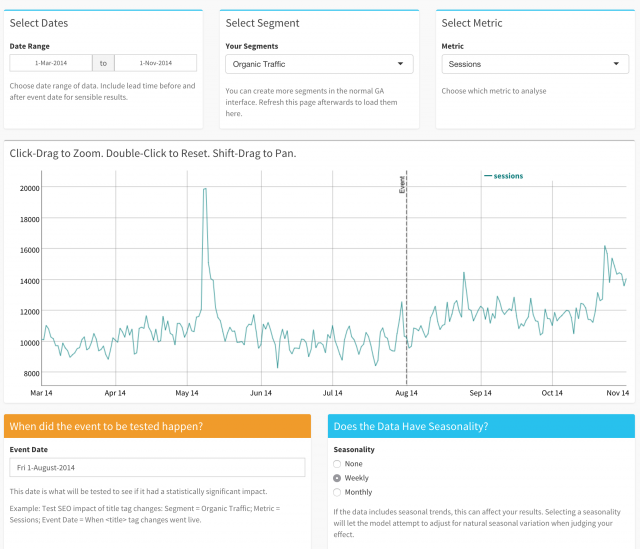
6. You will also see a vertical line labelled “Event” in the screenshot. Move the line to when the SEO changes occurred, this date will be used to calculate the statistics.
7. The screenshot above shows the setup. In our case, the SEO changes went live on the August 01, 2014, so that date has been chosen in the field beneath the graph.
8. Most datasets also have a seasonality, especially e-commerce websites. Two are supported in this version, Weekly and Monthly. Other seasons such as Annual may be added in the future. We’re choosing weekly as we can see weekends are quieter than weekdays.
9. Once you’re happy, click over to the Results page in the top left hand corner.
10. The app will think a bit, then show you the results, as seen in the screenshot below.
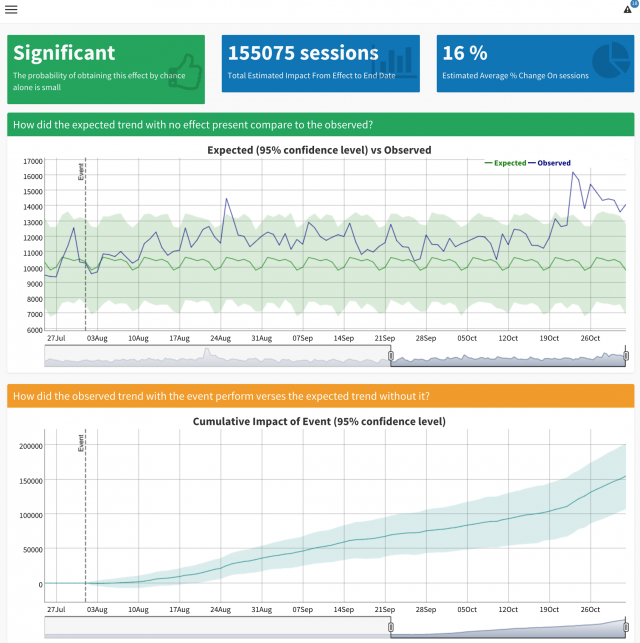
Here is an explanation of the results shown in the screenshot above:
- Top Left: An overall confirmation on whether the event seemed to have a significant effect or not.
- Top Middle: An estimated magnitude of how much extra SEO traffic was seen in this example.
- Top Right: An estimated % change on SEO traffic. In this example the title tags have contributed 16% more SEO traffic over the period.
- Middle Plot: This interactive graph shows the model’s expectation of the SEO traffic vs what actually happened. The light green area is the 95% confidence area of the estimate – a guess range of where the traffic should be. The blue line is reality. If the blue line is consistently over the green, that indicates a lift. It also includes a zoom window at the bottom; the default shows one week before the event so you can focus on the results.
- Bottom Plot: This is the same time-range, but shows the model estimate minus the guess, adding up over time. For instance, it estimated that by September 07 the SEO changes have added 50,000 more SEO visits. As time goes on, it gets less and less certain due to natural random variation, so the blue shaded area showing the 95% confidence level gets wider and wider.
Underneath the plots is the raw output of the CausalImpact model, so you can examine the details. It includes a nice written report that tries to give some insight into the results, plots that the upper graphs were based upon, and a table of the statistics computed.
That’s pretty much it. You can redo the process by going back to the Setup page or Start Again to re-authenticate. Note also that there is a notification log top right, so you can keep track of what you have been doing.
This is just one application, not necessarily the most interesting to you. Give it a go and check the most relevant applications to your website using your own data.
Model Assumptions & Best Practices
Just blindly trusting statistics is dangerous, and although GA Effect can be a powerful tool, don’t put faith in its results without putting care into its model assumptions. There are several assumptions that CausalImpact makes:
- The event you are testing did not influence pre-period as well as post-period. There needs to be a definite start date.
- The metrics post-event are correlated to the metrics after the event. Things like the website hosting or other big influences need to be as constant as possible.
- The event itself must not be correlated to what is measuring it; e.g. testing conversion rates after your website speed improvements went live would be problematic, as website speed also correlates with conversion rates.
- Examine how well the outcome can be predicted before the beginning of the intervention. Try running a dummy event before the real one – you should see no significance.
- The date range needs to be long enough before the event to give something for the model to train on, and enough after the event for the effect to be seen – but not too long that other events start to take hold. Think about what effect you are measuring, and amend accordingly.
Taking it Further
GA Effect is really just a wrapper around the CausalImpact R package, and only touches the surface of what it can achieve. For instance, only one metric is used for predictions, when multiple can be used (say Google trends for a brand term in the SEO example). You can also provide custom seasonality, and customise the model itself via its underlying bsts package.
The GA Effect app itself wouldn’t be possible without the incredible work of the RStudio team, with products such as Shiny, shinyapps.io and dygraphs making the app as it is. Last but not least the GA connection is courtesy of the rga() package by Bror Skardhamar.
If you’ve not used R before now, its a great time to start as all these people and more are working hard to make it more accessible every day. Once you’re hooked, you’ll never open an Excel sheet again 🙂 I write about R and Web Analytics and how it helps with my daily work at my blog, so join me there to follow my progress and hopefully help with yours.

