Today the Google Analytics team is launching a completely revamped Mobile App, which will make your data consumption easier, faster and more agreeable. The team worked very hard to make the App more robust too, you can do way more with it now, a great companion when waiting for a meeting to start, during your commute to/from work and when waiting for your kids at school!
In this article I will go through the main functionality that will now be available to you, including the scorecards, dashboards and visualizations. But if you are the video-kind-of-person, Ajay Nainani (GA Product Manager) recorded a great walkthrough.
If you want to get the functionality discussed below, go get the app, or update your current version either at Google Play or at iTunes Store.
Interacting with scorecards
The first thing you will notice when opening the app is the new Material design. Even if you haven’t read about it, you have probably seen many Material design cards, which are used in different Google products. Their introduction into the Google Analytics app brings consistency and beauty into the product.
In a business context, a scorecard is a record used to measure achievement or progress towards a particular goal, so that seems like a proper name to the cards used in Google Analytics. And the cards are not just beautiful, they are extremely functional, providing a series of new capabilities. Below you will find a screenshot pointing to all actions you can take inside a scorecard.
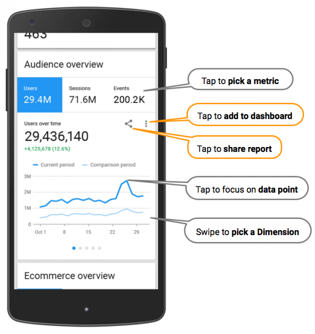
- Pick a metric – tap on any metric to update the chart. Sometimes there will be additional metrics that are not visible, you can swipe left to view all metrics available on any scorecard.
- Pick a dimension – swipe the visualization to the left to uncover new dimensions and visualizations (see the dots below the visualization, they indicate how many dimensions are available for any card).
- Focus on a data point – tap on a data point in the chart (e.g. a day, a country, a device type, etc.) to focus on it. This is available on all chart types.
- Share the report with anyone – tap the share icon to use your device native sharing functionality. This will share a screenshot of the report in question through any apps you have available, and it automatically adds the date and View you are sharing from. This is a great way to spark a data conversation with your colleagues!
- Save to dashboard – tap to add the scorecard to your dashboard, we will discuss this functionality later in this article.
Now that you are an expert in interacting with scorecards, let’s review the data available through the app by reviewing the overview section, your “landing page”.
Data Overview
One of the areas that was significantly improved is the Overview, it now provides you with a great bird’s-eye view of your data. And the charts look so nice that you will spend hours in it, without even noticing 🙂
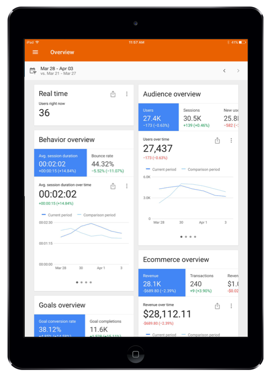
Here is the information you will find there:
- Real-Time – see how many users are on your site/app right now.
- Audience overview – learn how your users, sessions and new users are trending over time. You can also swipe the chart to compare your device usage, traffic channels, and countries.
- Behaviour overview – learn how users are behaving on your website by checking the following metrics: Avg. session duration, Bounce rate, Pages / Session, Number of sessions per user. You can swipe the dimensions to find the same break-down as in the card above.
- Goals overview – learn how your Goal conversion rates and absolute Goal completions are doing. The same dimensions are available to drill down into those metrics.
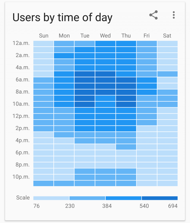
- Users by time of day – learn how traffic is spread across the week in your View. This is a great example of an insightful and beautiful visualization!
- Total events cards – you will find three cards showing the your top Events by categories, actions and labels. They will help you understand what kind of actions your users are taking (you need to have Event Tracking implemented for that).
Hopefully this will give you a good understanding of what you need to know in a glance. I won’t go over each section, but if you click on the left sidebar you will find options to go deeper into Real-Time, Audience, Acquisition and Behaviour. You will notice that a lot of thought went into choosing the right metrics and dimensions for each of them.
Next, let’s go through some dashboarding functionality to learn how to build a great chart repository with your most important dimensions and metrics
Building a dashboard on your mobile app
As mentioned above, while browsing the app, you can tap any report you find useful to add it to your dashboards for future analyses. In addition, once you are in your dashboard, you can duplicate and customize those reports to get just what you want. You can also create new reports from scratch from a wide selection of metrics, dimensions and visualizations.
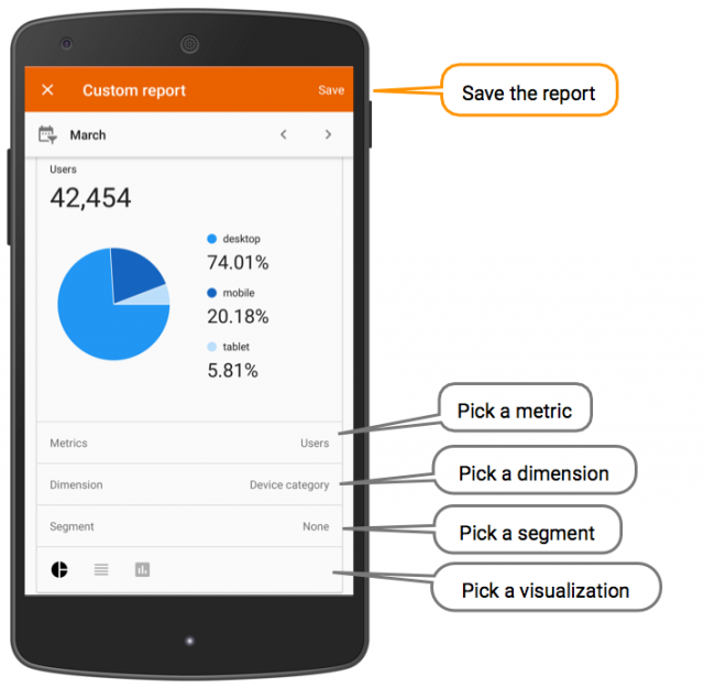
As you can see in the screenshot above, you have a few options when creating or editing a report:
- Metric – choose one metric per report.
- Dimension – choose one dimension per report.
- Segment – This currently works only with Segments created on the Web interface, you can choose any existing Segment.
- Visualization – depending on the metrics and dimensions you choose, you will be offered a set of visualizations that can be used to represent them.
Go on, build some reports!
And now, to close with the cherry on top, I would like to add some beautiful visualizations which, for me, makes it all a pleasant journey!
Visualizations: Cherry on Top
Time of the day heatmap
I find this chart incredibly insightful, it represents a large amount of data in a simple way. For example, you could compare when is the highest amount of traffic versus the highest conversion rate times of the day and use it to optimize your paid traffic.
Comparison bar and column charts
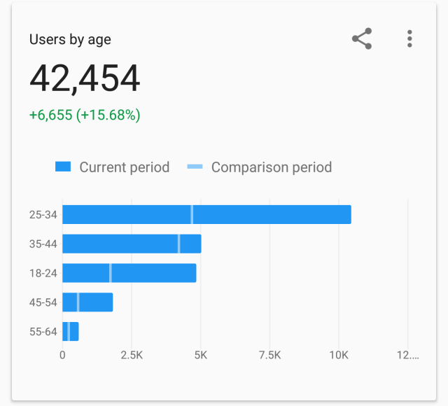
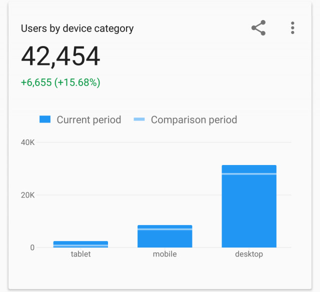
The bar and column charts below are quite nice to the eye. But what I really like about them is the way comparison was implemented, very elegantly! While the current time period fills the whole bar, the comparison period is just a line, clear and clean.
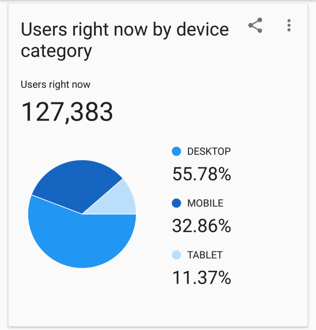
Pie chart (Good ol’ boy!)
No, I won’t really go into an essay on why you should or shouldn’t use pie charts, but they will be there for you if you want them! Sometimes they might be useful, but use them responsibly…
Now you know it! The new app is pretty cool, you should give it a try. Go get the app, or update your current version either at Google Play or iTunes Store. And happy analyzing!

