Your target audience is a diverse bunch. You have soccer moms, working dads, home-based entrepreneurs, students, etc. You just released your app, and you want to find out more about your users’ behavior. They convert higher on the weekends and holidays. They abandon their carts more in the evenings. Some abandon your app altogether when they reach a certain screen.
But WHY do they do what they do when they do it? Studying user behavior utilizing Analytics is something that has been breaking new ground on the desktop model. Indeed, some of the tools mentioned in this article, such as heat maps and live recordings are old news in the web world. But, now with mobile device use quickly surpassing the desktop, there has been an increased interest in studying user behavior in mobile apps.
The knowledge you stand to gain by implementing In-App Analytics in your app can help answer the eternal question: Why? It can also help smooth friction points in the user experience and help your app optimization efforts.
Visual in-app analytics is the next generation of mobile analytics. It tells the complete story by focusing on the WHY as opposed to traditional mobile analytics which focuses on WHAT the numbers are. Traditional mobile analytics presents you with key metrics, such as: total users, geographic location breakdown, how many use iOS/Android/Windows Phone, conversions, etc. The visual aspect goes a step further to communicate the ‘why’ by showing you how users are interacting with your app.
Below are a few of the ways that a visual analytics tools can get you the information you need to smooth and optimize friction points in the user experience of your app. The screenshots and examples were taken from Appsee’s mobile app analytics platform.
1. Touch Heatmaps
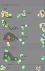
One of the many things you get out of using a visual in-app mobile analytics tool, is the ability to see exactly how users are using your app. This is often presented via touch heatmaps, which are aggregated recordings of all user interactions (tap, pinch, swipe). Heat maps can solve seemingly complicated issues like “why is my conversion rate low from a specific page” by showing you that, for example, users don’t understand where the “buy now” button is and, instead, click on an image.
Users are loyal fans of apps that understand how they use the app and where they are getting stuck. Give them what they want and they’ll keep coming back. Don’t give them what they want and risk negative reviews and abandoning users.
For example, by reviewing the touch heat maps of an e-commerce client, we noticed that most of the users tapped on one out of the two CTAs included in the “Buy Now” screen exclusively, leaving the other CTA ignored. By removing the second CTA the client was able to improve their CTR by 13%, which also resulted in an increased ARPU.
2.User Recordings
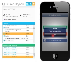
When you see why users are abandoning your app upon registration, how loyal users are interacting with your app, or see where users are when your app crashes, you gain knowledge that can drive insight into their behavior so you can further optimize the user experience. User recordings allow you to see your app in use through your user’s eyes, understand how they experience your app, and identify the problems they face. This can help you learn, for example, why users ignore a call to action, abandon a cart checkout or what they did to cause a crash.
A game developer had detected that their registration rate was quite low. Analyzing user recordings enabled them to see that the registration screen had a technical problem. They saw that when users were trying to register to the app with Facebook, a pop-up mistakenly opened saying the registration had failed. Users became frustrated with the app and didn’t return to complete the registration process. By fixing this problem, they increased their registration rate by 8% and the number of active users by 5%.
3.Realtime In-app Analytics
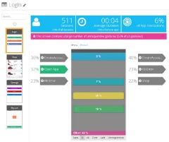
A mobile analytics tool processes a lot of information. While this is a key factor in its success, it is equally important how the app publisher is presented with this information. If you can’t make sense of all this data, you’ll be clueless on where to concentrate your optimization efforts and improve the user experience. Utilizing tools that provide visual in-app analytics reports can bring you pinpoint insights into your user’s behavior. These tools enable you to see, in real-time, where users are spending the most time, what screens they are in when they abandon the app, which screens have the highest quit rate or have UI problems, what is the user flow and much more.
A fashion retailer, when diving into the actions performed on each screen of their app, discovered that 28% of all the gestures (swipes, taps, pinches) performed while in the shopping screen were not responsive. That is to say, users were trying to complete actions via gestures that seemed logical to them – but the app wasn’t understanding or responding. This made it difficult for users to purchase their products. These kinds of usability problems can spell the death of an app. In addition, by analyzing users’ screen flow, the retailer deduced that only a tiny fraction of users proceeded to the payment screen for checkout. By resolving the usability problems, they were able to smooth out the funnel and increase conversion rates by nearly 20%.
Once you know how people use your app, and why they do what they do, the actionable insights an analytics tool provides you with, will enable you to smoothly pave the app optimization path. Showing users you are studying and reacting to their behavior, will bring loyalty and increase your app’s success.

