In the last year, there has been a growing trend of releasing infographics. Some of these are fantastic pieces of design, illustrating complex relationships between data. Most of them are not. Today, I want to expand a little bit more on a point I made in my last post, and explore the difference between good data presentation and bad.
In my last post, I ranted briefly about charts, complaining especially about pie charts and other poorly thought out data illustrations. I challenged the role of the chart, stating that it should be there to bring out specifics of large bodies of information, illustrating roles and relationships that would otherwise be obscured by too many numbers.
Aside: After publishing that, multiple people came to me asking “what about well constructed pie charts?” at which point I challenged them to come to me with examples. To date, no one has done it (though I know they exist!), so I am opening up this challenge to Online Behavior readers: find me your best example of pie charts and post a link to them on the comments – along with why you think they are better than just having tabular data.
Hans Rosling and the 3 Cs
A few years ago, I came across Hans Rosling’s “No More Boring Data” (video below).
Rosling uses a wonderful combination of motion charts and fantastic delivery to break myths about poverty using otherwise poorly understood economic data.
It struck me at the time that he had taken a large amount of data that was hard to interpret on its own, and by placing it creatively within context, managed to sum up 40 years of poverty in 4 minutes. In so doing, he made the data extremely clear, connected what would otherwise seem to be disparate data points, and then concentrates the viewer on specific data points.
This became my metric for a good data visualization, the 3 C’s of data visualization.
- Clarity – the ability to quickly understand what data the visual is displaying, and how it is displaying it.
- Connectivity – how well the visualization connects disparate data points.
- Concentration – how well the visualization brings certain (sets of) data points forward and focuses the viewer on them.
Good charts
Take, for example, xkcd’s phenomenal money chart. This graphic made a bit of a splash when it came out, and I like it for a number of reasons. Primarily because it’s a perfect example of the three Cs:
- You instantly know what they’re measuring, and how: a comparative scale of money!
- It makes incredible connections between data points that you wouldn’t normally connect: the typical CEO can afford 5 macbook airs after an hour of work & the average worker needs to work 2h to feed a family of four one meal. Crazy!
- It brings into focus the relationships between the values of various economic components: the 2007 credit default swap market was larger than the entire world GDP?)
This simple visualization style is highly effective, look at how well it communicates information:

Munroe takes it a step further, and includes next to this data on stuff like the cost of a meal for four, or (visible in the above section of the image) some common consumer electronics.
It’s not a pretty infographic (nothing xkcd does is) but it communicates extremely effectively.
Looking to juxtapose this, I came across (ironically) David McCandless’s The Visual Miscellaneum: A Colorful Guide to the World’s Most Consequential Trivia. McCandless is a renowned artist and data visualizer, he has given talks on the subject at TED, and puts out many amazing infographics. However, amidst his amazing work are a few weak pieces. Take, for example, his rather famous Colors in Culture infographic, a striking visual chart; however, as a communicator of information it is lacking:
- It’s not immediately clear how this chart is supposed to work, and once you figure it out, reading it is a headache.
- There’s so much potential here, but the layout diminishes its ability to illustrate connections between colors (such as whether certain colors of consistently negative connotations).
- This graph does not focus on any data points in particular.
In short: it’s art, but it’s not effective communication.
Applying visualization best practices to your data
As McCandless states, “we are all demanding a visual aspect to our information”. Visualization is something we all need to be thinking about when trying to communicate data. But how do we make sure that our visualizations are clear, make connections, and concentrate the user on the data we want to bring across?
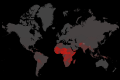
- Segment your data. I can’t express how important this is. Hidden insights are found by separating data points from each other and seeing how they interact. The more segmented your data, the better insights you get. A famous case comes from Hans Rosling, looking at how the poverty of the African region tells a drastically different story when if you split it into nations (see video) and analyze them independently.
- Check your legibility.Run it by someone who has never seen your visualization, and ask them to tell you what the chart is supposed to be illustrating. The longer they take, the worse you’ve done.
- Focus on your subject. If you don’t know exactly what your chart is measuring, your readers won’t either. Remember the point of your visualization, and what it’s supposed to show, and don’t get caught up in supplemental metrics or decoration.
Great data visualization relies on the ability to effectively communicate data. When you start creating visualizations, ask yourself: is what I’m creating clear, concentrated, and does it make connections?