It’s said that common sense isn’t common. I’d always scoffed at this sentiment until I started getting insights into the analytics of some pretty big companies. Not mom and pops or small businesses, but experienced consultants and big business. It seemed to me that even the experienced people tend to make some pretty common mistakes, all of them very easy to fix.
1. Not setting up goals or not setting up the right goals
Laugh if you want, complain that it’s too easy, roll your eyes at seeing this again, but this is a mistake made often and by people who should know better. I have looked at the analytics setups of very experienced analysts and found that even they don’t have goals – or that their goals don’t accurately reflect the purpose of their site.
Before you read any more, go into your analytics and ask if those goals you have there (you DO have goals, right?) are the correct measurements of success for your site.
2. Knowing what they’re comparing
It’s really easy to throw several metrics together, compare them, and draw conclusions without realizing that the metrics you’ve chosen aren’t as they seem. A classic example of these can be found in your advanced segments: paid search, non-paid search, and mobile.

Given that you probably run campaigns based on each, it can be tempting to look at each and compare how each campaign is doing. At least, until you realize the problem: the first two are traffic types, and the other is a platform type. As such, the third can contain data from the same users as the first two, and as such you can’t make the same kinds of direct comparisons of their success.
3. Taking easy metrics for granted
It’s very easy to take metrics for granted and not consider what they mean. One common example is bounce rate.

You know those high bounce rates? Those are actually very successful blog posts. They are pages that have been shared widely, had a huge amount of traffic from RSS feeds, and have gotten great comments.
The lesser ones? Unsuccessful pages.
So, why the high bounce rate? A lot of those other pages aren’t blog posts. With blog posts, anyone reading from a feed reader will come, read the page, then leave back to their reader for more. And often there just won’t be new content for them to read!
Bounce/exit rate is a tempting one to play with because it’s so easy to understand. “The percentage of people that exited after seeing only this page”. But it’s just a measurement of action, not intent, and while it can be a sign of the latter (and perhaps most often is), it’s best not to assume.
This holds true for a number of metrics, including Time on Page/Average Time on Site (did you know that visitors who only read one page get counted as 0 time on page? How about that those visits get included in your Average Time on Site?).
4. Choosing the wrong graphs
People love graphs. They break up tedious text, highlight important data, and just look pretty. However, people get so enamored with having them that they often forget that graphs don’t always help.

Charts are the only time when you should say no to pie.
Charts are about making information stand out in ways that it wouldn’t in tabular or paragraph form. The idea is to optimize the experience of the viewer by illustrating various aspects of their data. Pie charts rarely do this.
I would ask that people use the minimalist rule with pie charts. Take it out, see if it affects the reader’s understanding of the data. If not, then you don’t need it, and you may as well use a more engaging piece of imagery.
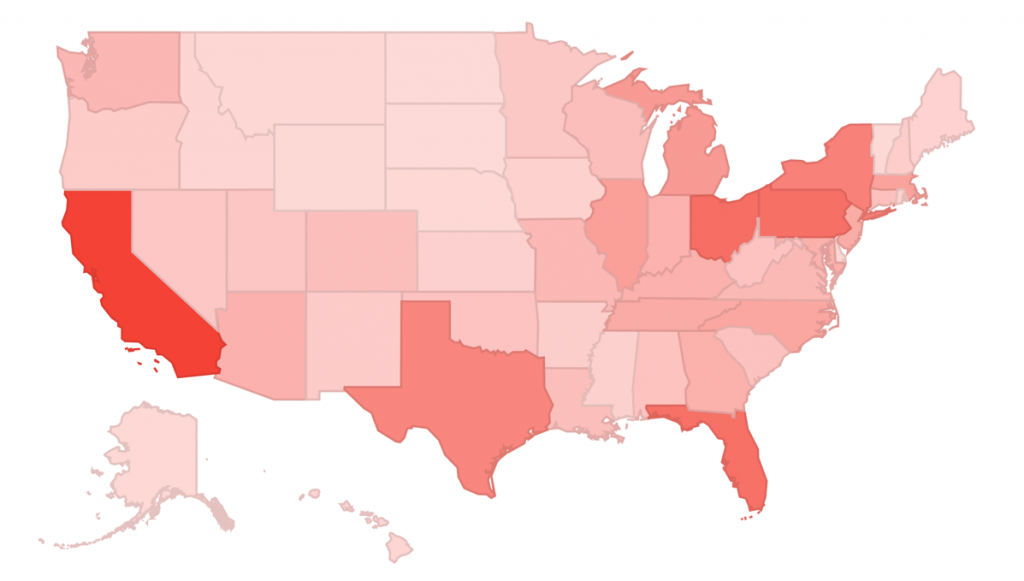
Example: Which of the following communicates its information more readily?

Or

Oh how nice it would be to say that the problem with graphs extends only to pie charts. However, the world of data is riddled with horrible examples of graphs. Smashing Magazine has a wonderful collection of them, including this doozie (thanks to The Economist):

What is it trying to say? I don’t know.
In short, before shipping out a graph, don’t ask yourself if it gets your point across. Ask someone else if it gets the point across better than tabulated data. If it doesn”t, back to the drawing board.
Editor note: Check out the Nuts and Bolts of Chart & Graph Types infographic for more on chart types