[Cross-posted from The Next Web] Whether you are a marketer trying to persuade people, a technologist building a startup, or an executive making business decisions, data is your partner. You can use it to make better decisions and create insightful data stories inside and outside your company. The first step is to accept your data relationship: you are partners forever. Once you understand that, there is an important consideration that will define how to tell your data stories: the context of where they live, which also defines the audience that will interact with them. In this post I will go through some important lessons I learned when visualizing and communicating data in and outside Google.
Data is your partner, live with it!
Data is no longer “next year’s big thing”, we have gone through that many times over and almost everyone accepts data as a valuable team member. But not everyone can understand and make use of it optimally, which means lots of decisions are still made based on intuition – if you don’t believe me, check PwC’s Global Data and Analytics Survey 2016, it shows some interesting numbers on how often managers use data during the decision-making process. Data education is a crooked road and we have a long journey ahead of us.
One of the reasons for that is similar to the well-known phenomenon called mathematical anxiety, where people are afraid of maths as a result of past difficulties and traumas. Every one of us have interacted with data analyses (at work, newspapers or academic research) that were created by unskilful communicators, people that might be amazing statisticians but lack the ability to convey the stories behind the numbers. That creates anxiety and could prevent professionals from even trying to understand data.
I believe the reason the data community is not growing like weeds is because professionals are not confident enough with numbers and charts. I have written about how to overcome the fear of analytics (and help others), here is a quick summary.
- Never mock people for not understanding a chart
- Take baby-steps towards numeracy
- Make analytics more fun
When you create a visualization you may affect other people both positively and negatively. If you create a complex and unintuitive visualization, you might be creating a phobia on other people, and they will forever hate numbers and stats. However, if you create a powerful and beautiful visualization, you might be persuading another mind to join the data visualization tribe.
Below are some ideas that might help you craft better data stories, both for businesses and in general.
Stories tailored to businesses, the world, and beyond…
There are many ways to communicate data, but choosing the right format will depend on where the data will be published or presented, the context. Is it a daily performance report or a quarterly result presentation? Or a behavioral analysis using web data? Or an interactive visualization showing global trends?
I’d like to break down data stories into two main branches: business reporting or analysis, and visualizing the world. These groups can show very different characteristics, so let’s look into each separately.
Business reporting or analysis
I recently had the opportunity to interview Avinash Kaushik, Digital Marketing Evangelist at Google. In our conversation we discussed techniques to create great data stories, focusing on businesses. Avinash talked about his business framework See, Think, Do, Care and the role of data visualization during the decision making process.
We also discussed data visualization (see minute 11:08), and Avinash explains how not to make silly mistakes when using data in a business context. He makes the differentiation between three main types of visualizations:
- Elaborated stories presented with the intent to change people’s views on a complex subject (what I call visualizing the world).
- Strategic analysis of business results presented to executives.
- Day-to-day reporting used to drive most small business decisions.
Avinash differentiates between analysis “packed together” with a storyteller, which allow for more complex visualizations, and day-to-day reporting, which are supposed to stand on their own and help people make decisions by themselves.
Considering the data delivery circumstances is a great start when designing your visualizations as they will inform the presentation style and level of complexity that can be used. While every visualization should strive for simplicity, a daily report (and business visualizations in general) must be extremely clean and self-explanatory, as the data storyteller won’t be there to help the decision maker.
Below is a quote by Avinash summarizing his views on how to succeed with data.
“On a business context, a data visualization has to do one job really well, and it has to answer the question ‘so what?’ If your data doesn’t answer the ‘so what’ question, and if there isn’t a punchy insight that drives action, all you have is a customized data puke, it looks really nice but it serves no purpose. If you want to drive change, you have to get to the simplest possible way to present the data, and once you get to it ask the so what question. After you answer it, ask if it quantifies the opportunity, if it does you are going to win.”
Visualizing the world
Luckily to our society, visualizations are increasingly used in a broader context, where the goal is not to understand the business or track performance, but to educate the public and change people’s minds. There are some great examples of visualizations that make a difference, but probably the most famous is Hans Rosling motion charts, where he debunks several myths about world development.
I’ve written about data stories in the past, discussing why it is important and providing some ideas on how to use data visualization to tell stories. Basically, here are two really important things you need on a good data story:
- It stands on its own – if taken out of context, the reader should still be able to understand what a chart is saying because the visualization tells the story.
- It is easy to understand – but while too much interaction can distract, the visualization should incorporate some layered data so the curious can explore.
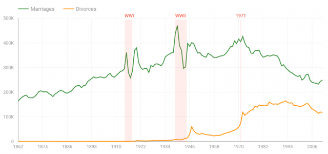
Recently I worked on a data story with my colleague Lizzie Silvey, where we analyzed stats from the UK Office for National Statistics. We looked into Divorce and Marriage trends starting from 1862, and came up with an interactive visualization. Below is a screenshot with some of the insights on how changes in the law impacted marriage and divorce rates in the UK. Check the visualization to play with the data.
Whether you are working on a monthly report or a world-changing visualization, if you take the time to uncover and communicate the stories behind the data, you will be contributing to better decisions in your company and in society in general.

