If you’re not familiar with A/B testing, it is all about testing which version of a page is more effective in persuading the visitor to perform an action on a website; be that signing up to a list or buying an item on an online store. It allows you to incrementally optimise your landing pages to be more effective in turning visitors into customers or subscribers. A/B testing revolves around a framework of Hypothesis > Testing > Measure outcome. The hypotheses could be anything – a more clearer value proposition, a more effective layout etc.
But before coming up with a hypothesis, you need to have a good understanding of the current state of your website. Knowing is the first step in figuring out what to change. Fortunately, there are a host of tools out there that allow you to tap into how visitors interact with your website.
Disclaimer – I am in no way affiliated with any of the companies mentioned below but I use them on a professional basis and am recommending it as such.
Analytics Tools – Google Analytics / Mixpanel / Kissmetrics / Canddi
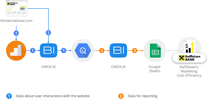
Your web analytics is your first port of call. With a wealth of data that gets tracked, its always safe to assume that you will find some answers here.
A majority of websites have Google Analytics installed which should give you a rough idea of how visitors interact with your site even if you don’t have an advanced tracking set up. If you haven’t already installed it, then you should invest some time in it immediately, it is one of the best analytics tools available for free. You can copy the code and deploy it on your site and you will get a good amount of data to work with. Additional customisation will provide data to answer your business needs.
Replay Tools – Mouseflow / Crazyegg / Ghostrec/ Inspectlet
These tools allow you to view a visitor’s session as if you were standing behind their shoulders. Video replay tools give deeper insight into what it would be like for that visitor browsing the various pages on your website.
The tools mentioned above also combine clickmaps and heatmaps which will show you how far down the page visitors are scrolling and where they click. It always surprises me when visitors click on elements on a webpage that aren’t clickable but the fact that they click it means they expect something there.
Is your value proposition hidden or your call to action button not visible? Scrollmaps can answer that for you. Hot or cold? are visitors seeing everything?

Survey Tools – Qualaroo, Webengage
There is nothing like getting a customer to tell you exactly what they are thinking of you.
Whereas analytics gives you quantitative feedback, survey tools helps you collect qualitative feedback. This works by nudging users that meet certain criteria (e.g. Returning users or visited site through a PPC campaign) and asking them a question related to the page they are on.
They would see a popup like this.
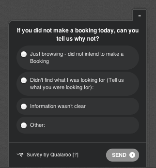
The survey pop ups can ask them questions and give them choices or allow them to enter their own answers. Allowing them to enter their own answers will give you honest feedback which you can then filter into your A/B Tests.
In the example below, we found out that a lot of visitors weren’t booking because they were just browsing. The visitors that filled up Other told us that they weren’t able to determine if a property was pet friendly or not.

Live Chat Tools – Olark, Zopim
Offering the facility to chat with someone on the site gives the visitor an avenue for contacting you as they hit an issue whilst browsing the site.
Lets say that a visitor can’t find certain information on your site or how to arrange demo, the live chat facility will allow them to get quick answers from your customer service team and help resolve the situation faster. Incidents like these can act as a good resource on what improvements you should test next in your A/B Tests.
Hearing the “Voice Of The Customer” is important. A/B Testing is all about improving the persuasiveness of your webpage and the more you know about your visitors the better you will be able to persuade them.
Tying this all together
The internet is full of case studies where experts advocate conflicting recommendations on changing button colours or placing items above or below the fold. But every website is different. Best practices should always be tested and Conversion Optimisation is all about understanding your visitor better.
Using research tools to analyse user behaviour on your website before setting up tests will show you parts that need to be improved. Your analytics, clickmaps and heatmaps will show you how the visitor interacts with your site so you can decide if your call to action should be placed somewhere else or maybe your copy needs changing. Surveys and live chat allow you to get real honest feedback from users.
This feedback is way better than blindly making changes based on your gut feeling or best practices.

