Dashboards are used across the world by most people (and organizations), either in the form of a car dashboard or in a business context. Every marketing professional talks about dashboards and why he or she needs one; but what exactly is a dashboard?
In an article named Dashboard Confusion Revisited (link to pdf), Stephen Few discusses the misunderstandings around dashboards and clarifies the subject using the following definition:
A dashboard is a visual display of the most important information needed to achieve one or more objectives; consolidated and arranged on a single screen so the information can be monitored at a glance.
With that in mind, I will discuss the options available inside Google Analytics that will enable analysts, marketers and website owners to build the most effective dashboard to monitor their objectives.
I will focus on the tool capabilities and try to describe use cases for certain widget types, chart types and other functionalities. It is up to you to define your goals and the metrics you will need to use in order to monitor them.
One important comment before we dig deeper… I will write quite often about Metrics and Dimensions, so if you are not acquainted with them, check this help center article.
Finding & Creating Your Dashboards
When you log into Google Analytics you are automatically directed to your Audience Overview report. Right below the orange navigation bar, on the left navigation, you will see a Dashboards tab where you can see your existing dashboards or create new dashboards.
There are many great dashboards ready for you to import (see examples at the official solutions gallery), and I warmly recommend you to try those solutions. However, I believe an understanding of how dashboard creation works will help you customize them for your own needs.
So let’s start! When you click the dashboard tab shown above you will have an option to + New Dashboard. Click on it:

Google Analytics went the extra mile to create a “Starter Dashboard” for people that might not enjoy the freedom of the blank page (to paraphrase Irvine Welsh). But I assume you do like the blank page 🙂 So go for the blank canvas.
Dashboard Widget Types And Their Strengths
The dashboards on Google Analytics are composed of widgets, components on the interface that enable you to see a specific chart. There are currently 6 types of dashboard widgets, and 4 of them can be used both for standard and real-time data. Below is a description of each.
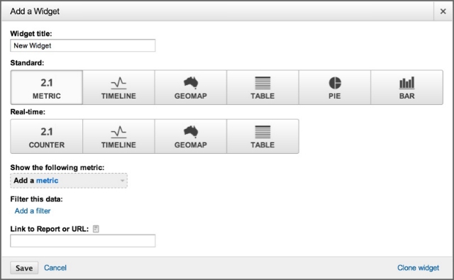
Note: You can create up to 20 dashboards, and each dashboard can contain up to 12 widgets.
1. Metric Widget
 Starting with the standard metric widget (i.e. not the real time data)… this widget presents a single metric, no charts. It is ideal if you need to check one piece of information every day. For example, you are responsible for an online store and want to know quickly what was the store revenue in a specific time range; or you want to know how many times your mobile app crashed during the same period. Here you go, that’s one widget you should add to your dashboard, but make sure it contains a really important number!
In the screenshot in the left you can see an example. Note that the title of the widget (which is customizable) is “USA Revenues”. In addition to choosing a widget title and a metric (in this case revenue), you have two additional customizations:
- Filter this data: this enables you to filter the data using any available dimension. So, for example, if you want to see only USA data, you will use dimension “Country / Territory” and include only United States. One nice touch is that you will still see the unfiltered metric, which gives you context. See the grey line just below the metric telling you which percentage of the total revenue is the United States revenue.
- Link to Report or URL: if you would like to have the title of the widget link to a specific report you would have to add it to this field. In our example, I would link the widget to the Product Performance report, so if I want to drill down into which products brought revenue I would be able to see that with one click. Just search the report you want to link to and grab the URL to paste here. Please note that when you create a widget from within a report (by clicking on “Add to Dashboard” in the top-left of any report) this field will be automatically populated by Google to link to that specific report.
The counter widget is the real time version of the metric widget, it shows the number of active visitors currently browsing the website. It can be grouped by different dimensions, which means you will see a bar below the counter showing the distribution of the active visitors into, for example, medium or new and returning visitors or mobile and web visitors. It will certainly make the dashboard live and cool 🙂
2. Timeline Widget
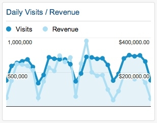 That’s the widget I personally use the most since it shows a trend; usually I am looking for a chart that tells me a story, and I think the timeline tells me what is going on in the last x days. Especially as I can have two lines shown in it, usually one related to quantity and the other quality.
As you can see in the screenshot in the left, I used two metrics in the chart: daily visits and revenue. The first shows me the amount of people I brought to the website, which is good to know but doesn’t really pay my bills; the second tells me how much money I brought during the same days. So, as you see, there was a day during that period that I brought a very small additional people but a lot of additional revenue. That’s great, now it is time to leave the dashboard and go see what I have done that day and repeat it every week!
The Timeline widget can also be used with real time data, and it will show the real time activity either for the last 30 minutes or for the last 60 seconds of activity.
As with the Metric widget, you can also filter the data and add a link to it.
3. GEO Map Widget
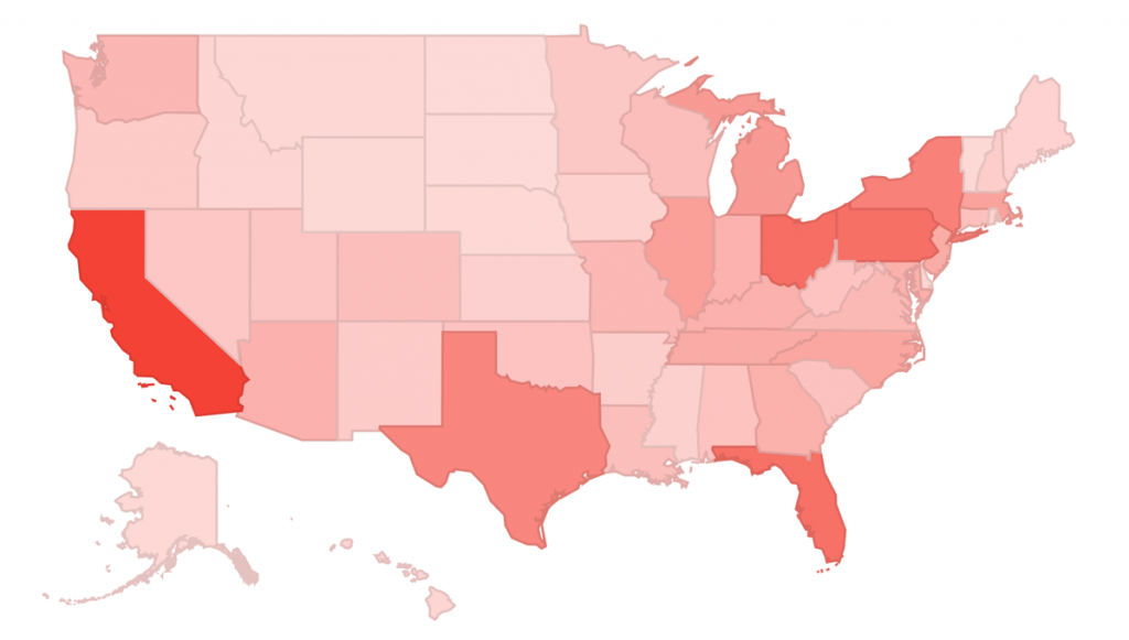
The GEO Map Widget is a very handy tool if you are distributed around the globe. It allows you to see how a specific country is contributing to your website in a glance. You can see, for example, what is the ecommerce conversion rate in a specific country as compared to the whole continent (or the world); and more interestingly, you can see how this rate changed in two different time ranges (like in the screenshot below)
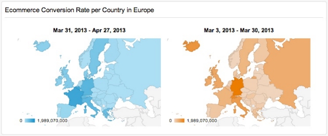
The GEO Map widget can also be used with real time data, and it will show the real time activity either for countries or for cities. Again, you can group those visitors by regions as well.
As with the Metric widget, we can also filter the data and add a link to it.
4. Table Widget
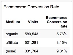 Table widgets are great for monitoring landing pages, content, product and PPC campaign performance. You will see a list of the dimension chosen along with two metrics of your choice. So, for example, you can look at your mediums and how well they are performing. In the screenshot in the left it is crystal clear that the email marketing manager should get a promotion!
The real time version of the table widget is an interesting one, though it is complex to use. You will be able to choose up to three different dimensions and the widget will present a pivot table showing the combinations between these dimensions in real time. (Give it a try and share your thoughts on the comments below.)
In both version you will be able to show the table with 5 to 10 rows of data, and you will also be able to filter the data and link the report to a URL.
5. Pie Widget
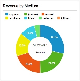 I am not a big fan of pie charts in general, I think they are often misleading. If you want to know more about my general opinions on data visualization, take a look at Nuts and Bolts of Chart & Graph Types.
Pie charts can be used to visualize data such as percentages out of a whole. Their main advantage is that they are widely used in businesses contexts, so professionals might feel more comfortable using them. However, sometimes it is hard to compare different sections of a given pie chart. As we will see in the next section, they can be replaced by the bar chart.
In Google Analytics, you will be able to choose one metric and one dimension to it. So, as you can see in the example in the left, you will be able to show revenue by medium. You can choose to either use the regular pie chart or to use a donut chart, which has a nice touch to include the total metric being shown. You can also decide on showing from 2 to 6 slices on the chart, and you can filter the data and add a link to it.
6. Bar Widget
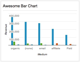 The bar widget is probably the most powerful of all widgets, it offers a multitude of customizations options. As you can see in the screenshot on the left, we are able to create charts where we show a metric (in this case revenue) group it by a certain dimension (in this case medium) and pivot it by a second dimension (in this case sub continent).
Going further into this example, we can see that while the blue bar (Northern America revenue) is slowing decreasing among different mediums, the green bar (Australasia revenue) disappears in the affiliate and paid mediums, meaning there is no revenue coming from Australasia on affiliate and paid campaigns. On the contrary, we can see that the red bar (Northern Europe revenue) is almost non-existent for organic, “(none)” and email and grows for affiliate and paid traffic. The point is: this chart tells a story.
Additional customizations that you will be able to apply using this widget:
- Show up to x bars: you can decide to show from to 2 to 9 bars in the chart.
- Use a horizontal version of this chart.
- Stack series elements such as pivoting, segmentation or date comparison: I personally think this creates a confusing chart, I prefer the style shown in the screenshot where the pivot is shown in different bars instead of stacking them up.
- Show values of the vertical axis.
- Show values of the horizontal axis.
- Show title of the vertical axis.
- Show title of the horizontal axis.
- Show up to x gridlines: you can either decide to show from 2 to 4 gridlines, not to show any, or to let Google Analytics decide (Auto).
- Filter this data: the data on the widget can be shown for any particular set of data, e.g. you can see the widget only for PPC traffic.
- Link to report or URL: you can link the chart to a specific report.
Dashboard Functionalities
I reviewed above all the widget types that can be used to create charts to be placed in your dashboards. Now, I will go over its functionalities, i.e. what can be done on top of it to monitor your data, share, export and customize the dashboards. These options will be seen right below the dashboard name, above the widget section.
1. Advanced Segments / Unified Segments
Very often you will create a dashboard to monitor your objectives but not one that can be used to monitor each segment of your visitors. For example, if you see that there is a strange drop in the conversion rates on a particular day, you might quickly apply your segments to see where this drop come from, than you could move on to a more detailed analysis using the standard reports.
For this purpose you can use Segments to isolate and analyze specific parts of your traffic. You can either click “+ Create New Segment” to build a new one or click the name of an existing segment to apply it to the dashboard. Learn more about the Segment Builder in this help center article.
2. Share
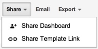 Sharing is a critical functionality and you should be using it! If you create an awesome dashboard you should share it with your teammates so that they can take advantage of it too; and maybe your manager should have access to it so that he can see how well you are doing your job 🙂 You will see that there are currently two ways of sharing a dashboard (to see them click on the share button just below the dashboard title):
- Share a Dashboard: the dashboard will be available to all other users in that profile / view.
- Share a Template Link: this will generate a URL you can send to other users.
If you have a great dashboard please share the link in the comments!
3. Email
Often times, you will need to send the dashboard as a PDF file instead of sharing it. This might be the case if the person that needs it is less comfortable with Google Analytics or if you would prefer to send it to yourself as a reminder every day, week, month or quarter. In this case you would use the email functionality. You can configure the following for your email:
- Destination: enter any emails that should receive the dashboard.
- Subject: the subject of the email.
- Frequency: can be once, daily, weekly, monthly, quarterly.
- Day of the week/month: for weekly and monthly emails you will be able to choose the day of the week/month that the dashboard will be sent to you.
- Advanced Options – Active: allows you to have an “expiration date “, i.e. you can set this email just for the period of x months and then it will stop automatically.
- Content: you can write any content to be added to the email with the file.
4. Export
This option enables you to download a PDF version of the Dashboard into your computer instantly.
5. Customize Dashboard
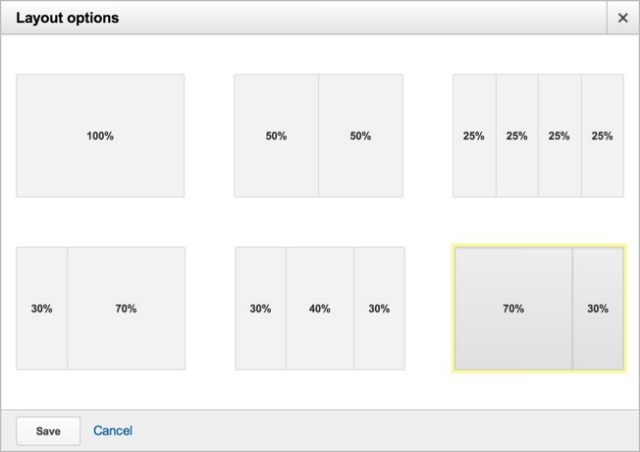
I love this! It allows you to decide the layout of the dashboard. So if you want some of the graphs to be larger than others you can use different layouts. Below are the options available to you.
Closing Thoughts
Dashboards are a great way to keep track of your website. It can save a lot of time on your (and your colleagues) day-to-day so it is certainly worth to invest time to have the right data in there.
And here is a wise a advice for making the most of Marketing dashboards:
“The number one thing in making your dashboards great is to make sure you know its purpose and that you are very focused. Your dashboards should be business changing and action inducing.”

