Web analytics data is worth nothing if it can’t be used in the correct way. In order for it to be used, it has to be understood. So how do you make data easy to understand? With visualisation of course! But visualizing data isn’t as easy as you might think. You have to get it right for both the user and the data.
As Ian Laurie, founder of Portent, said in his 2012 SES talk about Data That Persuades, “Your career isn’t just about being right, your career is about being understood.” You obviously have to get the data right, but what’s the point in giving the right number if no one understands it?
The advice here is to become the person whose data is understood. But more than that, you need to be able to explain everything to different people in a way that works best for them and the subject area. Visualisation methods can help with this, but you have to consider the audience and the subject – does the audience have a fear of tables? A hatred for Infographics? Or a love of graphs?
You don’t need to quiz them on what they like (although this may sometimes be beneficial – especially if it’s a one off analysis) but test what you think works best with the data and see how much explanation they need in order to understand it, then simply adjust for the next set of data. Feedback Is Essential!
I’d highly recommend going through Ian’s slides on the link above (they have explanatory notes) to see how he describes the best ways to get your data to persuade the recipient in the way that you want – and firstly to persuade them to even read it!
On top of this, earlier this year, I attended a Big Data and Marketing Conference at ESCP Europe and heard Judy Bayer from Teradata emphasise that analysts should be story tellers. This resonated with me as it is through stories that your data gains context and purpose, making it easier to understand and gain insights from.
So having covered why you need to think carefully about your visualisation, here are 10 common web analytics visualisations. You will have to make up your own mind about whether or not they would suit the story that your data needs to tell, as every data set and situation is different, but hopefully they will give you some ideas and inspiration.
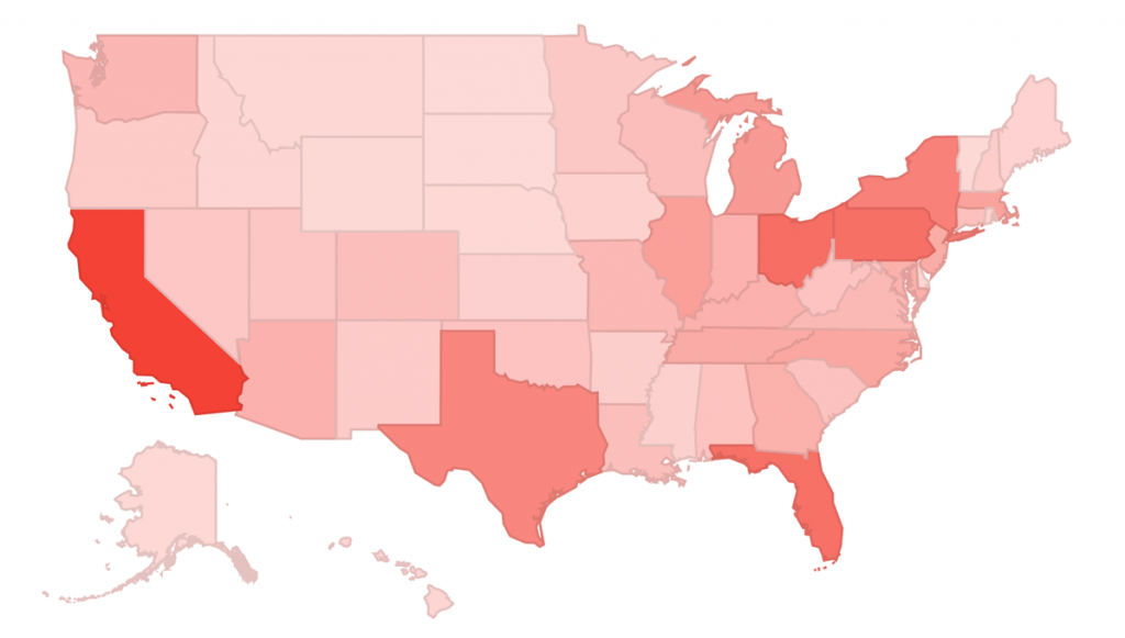
1. Tables
From a couple of numbers in boxes, to spreadsheets with hundreds of rows and columns, tables are there to show us the numbers, the whole numbers and nothing but the numbers:

What I like to do to add meaning to the data, is benchmark it and show whether it is good or bad:

By adding colours with conditional formatting, suddenly you are showing what the trends are and making it easier to make decisions. This is much simpler for readers of the data rather than expecting them to remember which numbers are good and which are bad as well as picking out highlights or concerns from a standard column of data.
To help you improve your tables, Annie Cushing has written a guide on conditional formatting which can help you make your data tell a story quickly and easily.
2. Bar/ Column Charts
Bar/column charts are not very commonly used, which is probably for good reason. A simple one shows a clear picture; however, the format does not lend itself for truly understanding the data, how it’s got there and where it’s going.
Here’s an example where the simple column chart tells the story well enough. It’s the algorithm weather report on MozCast, graphing how much the Google algorithm for organic search results has changed compared to the previous day, based on a scale they have created:

Now, they could have used a line graph for this, as each bar represents the next day, but using columns actually shows each day by itself clearer than it would in a line graph. In addition to the graph, MozCast also uses a picture chart to help tell the story – see the examples under Pictures, below, to see how they add meaning to the column chart.
This means the column chart is used as a backup to show more data on a scale. Simple, yet effective for spotting anomalies because your brain can quickly spot which bars are higher/lower than others.
I think the best uses for bar and column charts are when you want to show comparisons on a simple scale, whether it’s one series of data or two:

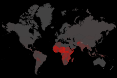
3. Pictures / Metaphors
As mentioned above, MozCast uses a picture chart to help tell a story of the data – the bigger the changes the stormier the weather shown:


This method is like taking a small part from an Infographic, showing just one thing instead of a lot of data which might lose some focus. Pictures could be set to show at the top of your reports so that without looking down at the data you can quickly see whether it’s good or bad.
4. Line Graphs
I prefer line graphs to bar charts, simply because you can put more on it without making it harder to understand. Have a look at these two examples – would you choose the line or bar?

The column makes it easier to match the data to the number, but harder to see the flow of each of them so you will need to consider what your objective is and what is more important to the reader when choosing which one to use.
5. Pie Charts
Unless you want to show how different sections make up the total, you can probably skip over pie charts. Their main function is to show the split of several items (hopefully not too many) within one thing, examples where you might want to use pie charts include:
- Website traffic by medium
- Brand vs. non brand anchor text
- New vs. returning visitors
- Mobile vs. non mobile
- Visits from each tablet device

6. Area Graph
I don’t use area graphs often, but I enjoy them when I do. The main use I’ve found for them as a web analyst is breaking down segments and seeing how they stack up against each other over time for one metric at a time.
For example:

By showing the pageviews by area, you can see how they have grown and how they match up to each other, as well as identifying problems when one segment decreases significantly. You will sometimes need to explain that you’re stacking the sets of data on top of each other (or that it’s overlaying if that’s the style you choose).
7. Motion Charts
Charts that move are not always possible, due to them not working on paper. However, they can be used to great effect to show change on a three dimensional scale.
Here are a few screen shots from a motion chart showing mobile and non-mobile data (green and blue circles respectively), with visits on the X axis and pages per visit on the Y axis. The circles increase and decrease in size depending on the Conversion Rate they had each month.


See the improvements over time? The balls increase and decrease in size slightly but they both move to the right.
8. Pivot Tables and Charts
A great way to visualise data and chop and change between metrics is through a pivot table. Simply put, they are used to summarize data and easily allow for you to show different metrics. They can take a bit of time to get your head round to start with, but once you’ve started using them you won’t be able to stop!
Richard Baxter wrote a great guide on using a Pivot Chart to show search volumes or traffic alongside search engine rank for a set of keywords.

If you are presenting a pivot table or chart to someone else, make sure they will understand it before you go to the trouble of making it. Pivot tables and charts can include a lot of information and the more you include, the more it might get confusing.
9. Words
 What other visualisation tells you what the data represents better than an explanation in words? It might be that you have all the spreadsheets and data in the world, but you can sum them up with a short explanation that saves anyone else having to dive into the data – this might be the quickest way to help you get your point across.
You can never assume that everyone will be able to see the data in the same way that you see it, so by adding a few explanatory words you can help them gain insights and understand what action to take from the data.
You can also use word clouds if you have a list of keywords to visualise, I like to use this for keyword research and site search term analysis:

10. Infographics
It’s definitely the most up-and-coming way to show your data – but is it right for you? Infographics are good when you’re using data to share information, raise awareness and build up discussion for your topic (mainly with the aim of generating traffic and links for your website).
They can be very innovative in the way that they show data making them a good data visualisation tool, like this example of the history of beer. Although some purely use a combination of the methods outlined here, like this example. By combining the graphs, percentages, words and pictures together in a form that flows they can be more interesting and effective than using one method alone.
However, if you’re looking to visualise data in order to improve activity on a website or to get better results, then chances are you will be looking for a different type of visualisation on this occasion. Correct me if I’m wrong, but I’m not going to turn my monthly reports in to full on infographics until I can design amazing visuals that make perfect sense in the same time as it takes me to show the data in simple tables and graphs.
Concluding Thoughts
So there are many different methods that could be used, which is probably a good thing, considering the amount of different types of data we all work with. If you’re interested in some really interesting ways not to show your data, check out the examples in this post.
Hopefully this post will get you thinking more about the way you present your data and finding out whether or not the people looking at your data are getting the most out of it.
Please leave your thoughts on data visualisation in the comments below, it would be great to find out what methods you find successful and which ones don’t work for you.