As many of you, I use Google Analytics quite a lot, and I love the visualizations and the interface in general. But once in a while I am gifted with little data jewels that really make my day. We all know (or should know) that the chance of getting an exact 50-50 rate is the same as getting a 51-49, but round numbers have a certain glamour, and it is hard not to notice and appreciate them, especially when talking about very large numbers.
Usually, we look at it and appreciate the beauty for a few moments, maybe even share it with a colleague… but I also like to collect them 🙂 So, today I am sharing a few screenshots I collected over time with some nice patterns and symmetries.
Note: I am aware that it is possible to create any visualization on Google Analytics with fake data by simply going into the interface, right-clicking on numbers to “Inspect Element”, and changing the data in the source code. While that’s a great way to create a prank or just admire beautiful visualizations, in this article I am sharing charts I saw on real data, as I find it really mind-blowing, as mentioned above.
Symmetry: Lines, Pies, Bars
“The universe is built on a plan the profound symmetry of which is somehow present in the inner structure of our intellect.” Paul Valery


Patterns: Multi-Channel Funnels
“Art is the imposing of a pattern on experience, and our aesthetic enjoyment is recognition of the pattern.” Alfred North Whitehead

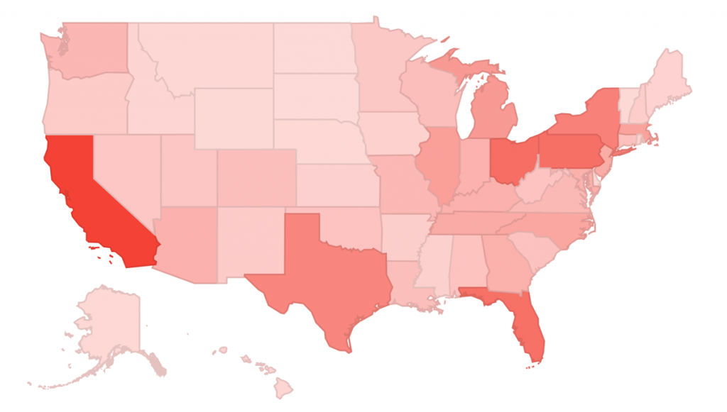
Display seems quite strong!

Colorful Data Patterns