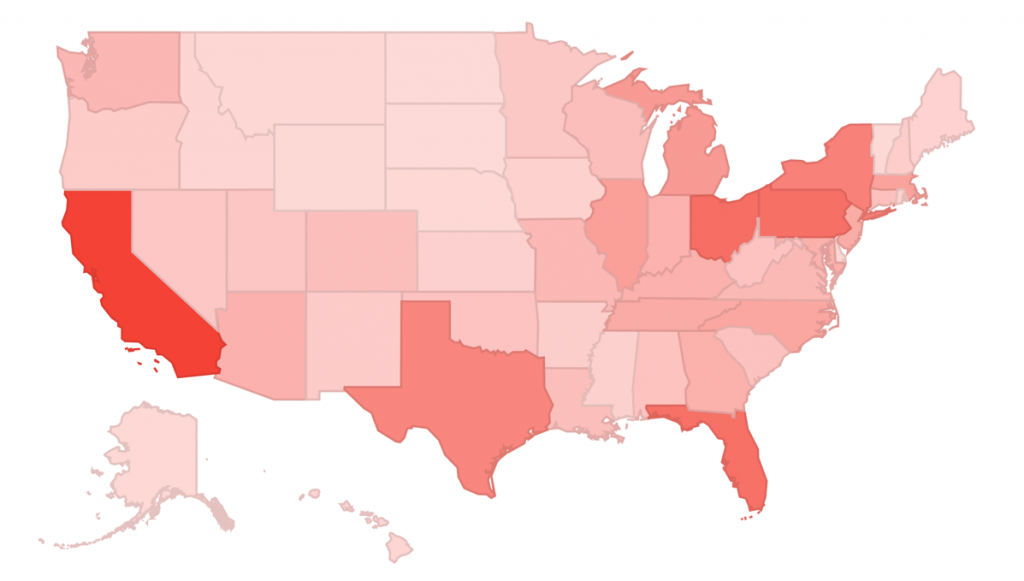
Not long ago I published a post on the Google Analytics blog about the power of using AdSense and Google Analytics together. In that post I went over the integration between both tools, described the reports available after linking your accounts, and also proposed techniques to optimize AdSense revenue using Google Analytics.
In this post I offer a dashboard that can be used to measure your most profitable channels, pages and demographics when it comes to AdSense revenue. You can add the dashboard to your Google Analytics account by following this link (make sure to be signed in to your account).
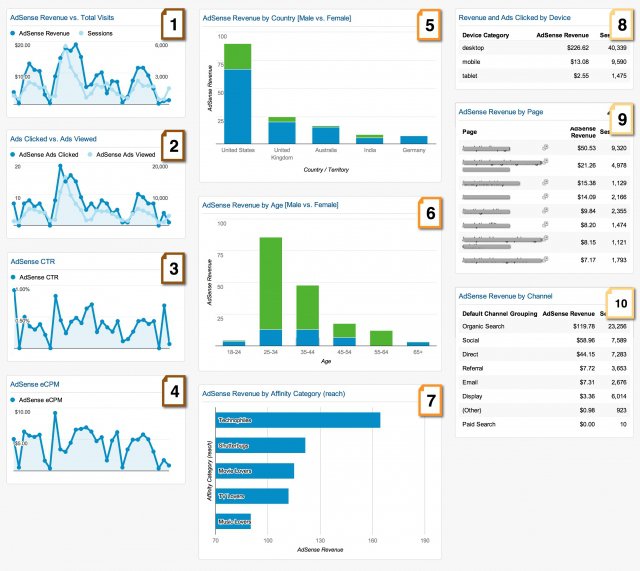
Below is a screenshot of the dashboard. As you can see by the different colors, each column has a theme; the first column shows overall performance metrics over time (widgets 1-4), the second focuses on demographics (widgets 5-7), and the third shows important information on behavior and acquisition (widgets 8-10). I discuss the widgets in each of the three themes.
Overall Performance Trends
1. AdSense Revenue vs. Total Sessions – shows the overall performance of the website. If you see diverging trends on the lines, it means that something worth checking is happening, drill down into it.
2. Ads Clicked vs. Ads Viewed – shows a trend of the absolute number of ads people are viewing on the website and how many of them are being clicked.
3. AdSense CTR – this widget summarizes the one above, the Click-Through Rate (CTR) is the percentage of page impressions that resulted in a click on an ad. You definitely want to see an upwards trend.
4. AdSense eCPM – the AdSense eCPM is the estimated cost per thousand page impressions. It is your AdSense Revenue per 1000 page impressions, a great performance metric.
Demographic Segments
Please note that the widgets below depend on having Demographics enabled for your account, learn more about it on this Help Center article.
5. AdSense Revenue by Country [Male vs. Female] – this stacked bar chart shows the AdSense revenue per country and each bar is divided between Males (blue) and Females (green). As we can see in the example above, Australia and Germany are heavily biased towards man, so a good tactic might be to find content that is particularly appealing to women and promote on the homepage of those countries.
6. AdSense Revenue by Age [Male vs. Female] – this stacked bar chart shows AdSense revenue per age group and each bar is divided between Males (blue) and Females (green). In the example above we can see that very old and very young visitors are heavily biased towards men, but all other age groups are biased towards females, especially 55-64. In the same spirit as above, it might be interesting to run a content analysis and adjust content strategy based on that.
7. AdSense Revenue by Affinity Category – this bar chart shows the AdSense revenue per affinity category. This information might be interesting to understand which groups are the most interesting in terms of revenue and might help driving the content strategy for the website.
Behavior & Acquisition
8. Revenue and Ads Clicked by Device – as we all know, we live in a mobile planet, so it is important to check if your ads are being clicked and generating revenue in all devices in a similar rate.
9. AdSense Revenue by Page – this table is a great indicator of which content is performing well and how much time you should invest in each topic.
10. AdSense Revenue by Channel – this table shows which acquisition channel is bringing the most profitable visitors.
Closing Thoughts
If you find this dashboard useful, you can download it from this link (make sure to be signed in to your account). If not, you can find dozens of other great dashboards in our Solution Gallery.
You can also take a look at Google Analytics dashboard guide which discusses dashboards best practices as well as the features available when creating and formatting dashboards.

